Project 1

library(tidyverse)  # Load ggplot2, dplyr, and all the other tidyverse packages
library(mosaic)
library(plyr)
library(ggthemes)
library(lubridate)
library(fivethirtyeight)
library(here)
library(skimr)
library(janitor)
library(vroom)
library(tidyquant)
library(rvest) # to scrape wikipedia page
library(kableExtra)
library(dplyr)
library(reshape2)
librarian::reshelf(dplyr)
Where Do People Drink The Most Beer, Wine And Spirits?
Back in 2014, fivethiryeight.com published an article on alchohol consumption in different countries. The data drinks is available as part of the fivethirtyeight package. Make sure you have installed the fivethirtyeight package before proceeding.
librarian::shelf(dplyr)
library(fivethirtyeight)
data(drinks)


# or download directly
# alcohol_direct <- read_csv("https://raw.githubusercontent.com/fivethirtyeight/data/master/alcohol-consumption/drinks.csv")
What are the variable types? Any missing values we should worry about?
They are three different variable types: character, integer, double. If we run the sum(is.na(drinks)) function there is not any missing values.
glimpse(drinks)## Rows: 193
## Columns: 5
## $ country <chr> "Afghanistan", "Albania", "Algeria", "And…
## $ beer_servings <int> 0, 89, 25, 245, 217, 102, 193, 21, 261, 2…
## $ spirit_servings <int> 0, 132, 0, 138, 57, 128, 25, 179, 72, 75,…
## $ wine_servings <int> 0, 54, 14, 312, 45, 45, 221, 11, 212, 191…
## $ total_litres_of_pure_alcohol <dbl> 0.0, 4.9, 0.7, 12.4, 5.9, 4.9, 8.3, 3.8, …Top 25 beer consuming countries
drinks %>%
  #select(beer_servings) %>%
  slice_max(order_by = beer_servings, n=25) %>%
  ggplot(aes(x= beer_servings,y= fct_reorder(country,beer_servings))) +
  geom_col()+
  theme_bw()+
  labs(
    title = "Top 25 Beer Consuming Countries",
    caption= "Figure 1.1",
    x = "Beer Servings",
    y = "Country"
  )+
  theme(plot.caption = element_text(hjust = 0))+
  NULL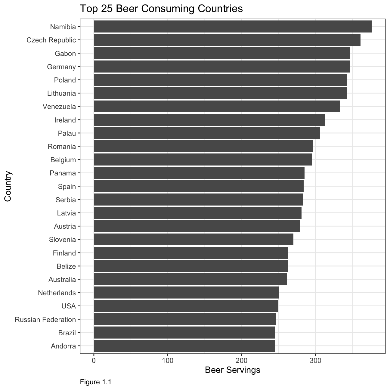
Top 25 wine consuming countries
drinks %>%
  slice_max(order_by = wine_servings, n=25) %>%
  ggplot(aes(x= wine_servings,y= fct_reorder(country,wine_servings))) +
  geom_col()+
  theme_bw()+
  labs(
    title = "Top 25 Wine Consuming Countries",
    caption= "Figure 1.2",
    x = "Wine Servings",
    y = "Country"
  )+
  theme(plot.caption = element_text(hjust = 0))+
  NULL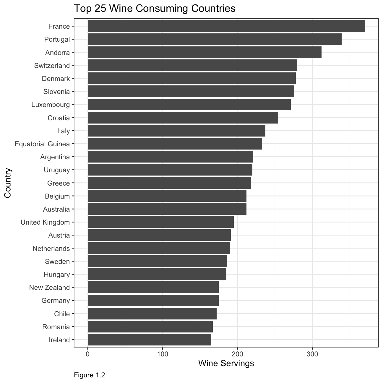
Top 25 spirit consuming countries
drinks %>%
  slice_max(order_by = spirit_servings, n=25) %>%
  ggplot(aes(x= spirit_servings,y= fct_reorder(country,spirit_servings))) +
  geom_col()+
  theme_bw()+
  labs(
    title = "Top 25 Spirit Consuming Countries",
    caption= "Figure 1.3",
    x = "Spirit Servings",
    y = "Country"
  )+
  theme(plot.caption = element_text(hjust = 0))+
  NULL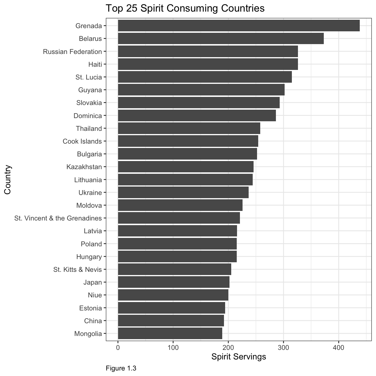
What can you infer from these plots?
The first two plots illustrate that most of the biggest wine and beer producers are also some of the top consumers. When looking at consumption by countries, it is interesting to note that the top 25 beer consuming countries have a relatively similar consumption in terms of servings, whereas in the other two categories the consumption varies by roughly 50% between the biggest and smallest consuming country within the top 25.
Analysis of movies- IMDB dataset
We will look at a subset sample of movies, taken from the Kaggle IMDB 5000 movie dataset
movies <- read_csv(here::here("~/Desktop/RR/my_website", "movies.csv"))
glimpse(movies)
## Rows: 2,961
## Columns: 11
## $ title <chr> "Avatar", "Titanic", "Jurassic World", "The Avenge…
## $ genre <chr> "Action", "Drama", "Action", "Action", "Action", "…
## $ director <chr> "James Cameron", "James Cameron", "Colin Trevorrow…
## $ year <dbl> 2009, 1997, 2015, 2012, 2008, 1999, 1977, 2015, 20…
## $ duration <dbl> 178, 194, 124, 173, 152, 136, 125, 141, 164, 93, 1…
## $ gross <dbl> 7.61e+08, 6.59e+08, 6.52e+08, 6.23e+08, 5.33e+08, …
## $ budget <dbl> 2.37e+08, 2.00e+08, 1.50e+08, 2.20e+08, 1.85e+08, …
## $ cast_facebook_likes <dbl> 4834, 45223, 8458, 87697, 57802, 37723, 13485, 920…
## $ votes <dbl> 886204, 793059, 418214, 995415, 1676169, 534658, 9…
## $ reviews <dbl> 3777, 2843, 1934, 2425, 5312, 3917, 1752, 1752, 35…
## $ rating <dbl> 7.9, 7.7, 7.0, 8.1, 9.0, 6.5, 8.7, 7.5, 8.5, 7.2, …Are there any missing values (NAs)? Are all entries distinct or are there duplicate entries?
There are no missing values within the dataset. However, not all entries are distinct. Character variables such as title,genre and director have duplicate entries.
Count of movies by genre, ranked in descending order:
m1 <- movies %>%
  group_by(genre) %>%
    count(sort=TRUE)
colnames(m1) <- c("Genre","Count of Movies")
m1 %>%
  kbl(caption = "Table 2.1") %>%
kable_classic(full_width = F, html_font = "Cambria")| Genre | Count of Movies |
|---|---|
| Comedy | 848 |
| Action | 738 |
| Drama | 498 |
| Adventure | 288 |
| Crime | 202 |
| Biography | 135 |
| Horror | 131 |
| Animation | 35 |
| Fantasy | 28 |
| Documentary | 25 |
| Mystery | 16 |
| Sci-Fi | 7 |
| Family | 3 |
| Musical | 2 |
| Romance | 2 |
| Western | 2 |
| Thriller | 1 |
Average gross earning, budget, return on budget by genre:
movies1 <- movies %>%
  mutate(return_on_budget = gross/budget)
m2 <- movies1 %>%
  group_by(genre) %>%
    summarise(average_gross_earning = mean(gross),
              average_budget_earning = mean(budget),
              average_return_budget = mean(return_on_budget)) %>%
  arrange(-average_return_budget)
colnames(m2) <- c("Genre","Average Gross Earning","Average Budget Earning","Average Return on Budget")
m2 %>%
  kbl(caption = "Table 2.2") %>%
kable_classic(full_width = F, html_font = "Cambria")| Genre | Average Gross Earning | Average Budget Earning | Average Return on Budget |
|---|---|---|---|
| Horror | 3.77e+07 | 13504916 | 88.305 |
| Biography | 4.52e+07 | 28543696 | 22.281 |
| Musical | 9.21e+07 | 3189500 | 18.818 |
| Family | 1.49e+08 | 14833333 | 14.076 |
| Documentary | 1.74e+07 | 5887852 | 8.699 |
| Western | 2.08e+07 | 3465000 | 7.063 |
| Fantasy | 4.24e+07 | 17582143 | 6.682 |
| Animation | 9.84e+07 | 61701429 | 5.009 |
| Comedy | 4.26e+07 | 24446319 | 3.714 |
| Mystery | 6.75e+07 | 39218750 | 3.269 |
| Romance | 3.13e+07 | 25107500 | 3.168 |
| Drama | 3.75e+07 | 26242933 | 2.946 |
| Adventure | 9.58e+07 | 66290069 | 2.412 |
| Crime | 3.75e+07 | 26596169 | 2.175 |
| Action | 8.66e+07 | 71354888 | 1.921 |
| Sci-Fi | 2.98e+07 | 27607143 | 1.580 |
| Thriller | 2.47e+03 | 300000 | 0.008 |
Top 15 directors with the highest gross revenue in the box office:
m3 <- movies %>%
  group_by(director) %>%
  summarise(total_gross_earning = sum(gross),
            average_gross_earning = mean(gross),
            median_gross_earning = median(gross),
            sd_gross_earning = sd(gross)) %>%
  slice_max(order_by = total_gross_earning, n=15)
colnames(m3) <- c("Director","Total Gross Earning", "Average Gross Earning","Median Gross Earning","Standard Deviation Gross Earning")
m3 %>%
  kbl(caption = "Table 2.3") %>%
kable_classic(full_width = F, html_font = "Cambria")| Director | Total Gross Earning | Average Gross Earning | Median Gross Earning | Standard Deviation Gross Earning |
|---|---|---|---|---|
| Steven Spielberg | 4.01e+09 | 1.75e+08 | 1.64e+08 | 1.01e+08 |
| Michael Bay | 2.23e+09 | 1.72e+08 | 1.38e+08 | 1.27e+08 |
| Tim Burton | 2.07e+09 | 1.29e+08 | 7.65e+07 | 1.09e+08 |
| Sam Raimi | 2.01e+09 | 2.01e+08 | 2.35e+08 | 1.62e+08 |
| James Cameron | 1.91e+09 | 3.18e+08 | 1.76e+08 | 3.09e+08 |
| Christopher Nolan | 1.81e+09 | 2.27e+08 | 1.97e+08 | 1.87e+08 |
| George Lucas | 1.74e+09 | 3.48e+08 | 3.80e+08 | 1.46e+08 |
| Robert Zemeckis | 1.62e+09 | 1.25e+08 | 1.01e+08 | 9.13e+07 |
| Clint Eastwood | 1.38e+09 | 7.25e+07 | 4.67e+07 | 7.55e+07 |
| Francis Lawrence | 1.36e+09 | 2.72e+08 | 2.82e+08 | 1.35e+08 |
| Ron Howard | 1.34e+09 | 1.11e+08 | 1.02e+08 | 8.19e+07 |
| Gore Verbinski | 1.33e+09 | 1.90e+08 | 1.23e+08 | 1.54e+08 |
| Andrew Adamson | 1.14e+09 | 2.84e+08 | 2.80e+08 | 1.21e+08 |
| Shawn Levy | 1.13e+09 | 1.03e+08 | 8.55e+07 | 6.55e+07 |
| Ridley Scott | 1.13e+09 | 8.06e+07 | 4.78e+07 | 6.88e+07 |
Ratings distributed by genre:
m4 <- movies %>%
  group_by(genre) %>%
  summarise(
            average_rating = mean(rating),
            median_rating = median(rating),
            min_rating = min(rating),
            max_rating = max(rating),
            sd_rating = sd(rating))
colnames(m4) <- c("Genre","Average Rating", "Median Rating","Min Rating","Max Rating","SD Rating")
m4 %>%
  kbl(caption = "Table 2.4") %>%
kable_classic(full_width = F, html_font = "Cambria")| Genre | Average Rating | Median Rating | Min Rating | Max Rating | SD Rating |
|---|---|---|---|---|---|
| Action | 6.23 | 6.30 | 2.1 | 9.0 | 1.030 |
| Adventure | 6.51 | 6.60 | 2.3 | 8.6 | 1.094 |
| Animation | 6.65 | 6.90 | 4.5 | 8.0 | 0.968 |
| Biography | 7.11 | 7.20 | 4.5 | 8.9 | 0.760 |
| Comedy | 6.11 | 6.20 | 1.9 | 8.8 | 1.023 |
| Crime | 6.92 | 6.90 | 4.8 | 9.3 | 0.849 |
| Documentary | 6.66 | 7.40 | 1.6 | 8.5 | 1.767 |
| Drama | 6.73 | 6.80 | 2.1 | 8.8 | 0.917 |
| Family | 6.50 | 5.90 | 5.7 | 7.9 | 1.217 |
| Fantasy | 6.15 | 6.45 | 4.3 | 7.9 | 0.959 |
| Horror | 5.83 | 5.90 | 3.6 | 8.5 | 1.014 |
| Musical | 6.75 | 6.75 | 6.3 | 7.2 | 0.636 |
| Mystery | 6.86 | 6.90 | 4.6 | 8.5 | 0.882 |
| Romance | 6.65 | 6.65 | 6.2 | 7.1 | 0.636 |
| Sci-Fi | 6.66 | 6.40 | 5.0 | 8.2 | 1.094 |
| Thriller | 4.80 | 4.80 | 4.8 | 4.8 | NA |
| Western | 5.70 | 5.70 | 4.1 | 7.3 | 2.263 |
m4 %>%
  ggplot(aes(x=Genre, y= `Average Rating`)) +
  geom_col()+
  theme_bw()+
  labs(
    title = "Ratings distributed by genre",
    caption= "Figure 2.1",
    x = "Genre",
    y = "Average Rating"
  )+
  theme(plot.caption = element_text(hjust = 0),
        axis.text = element_text(size=5))+
  NULL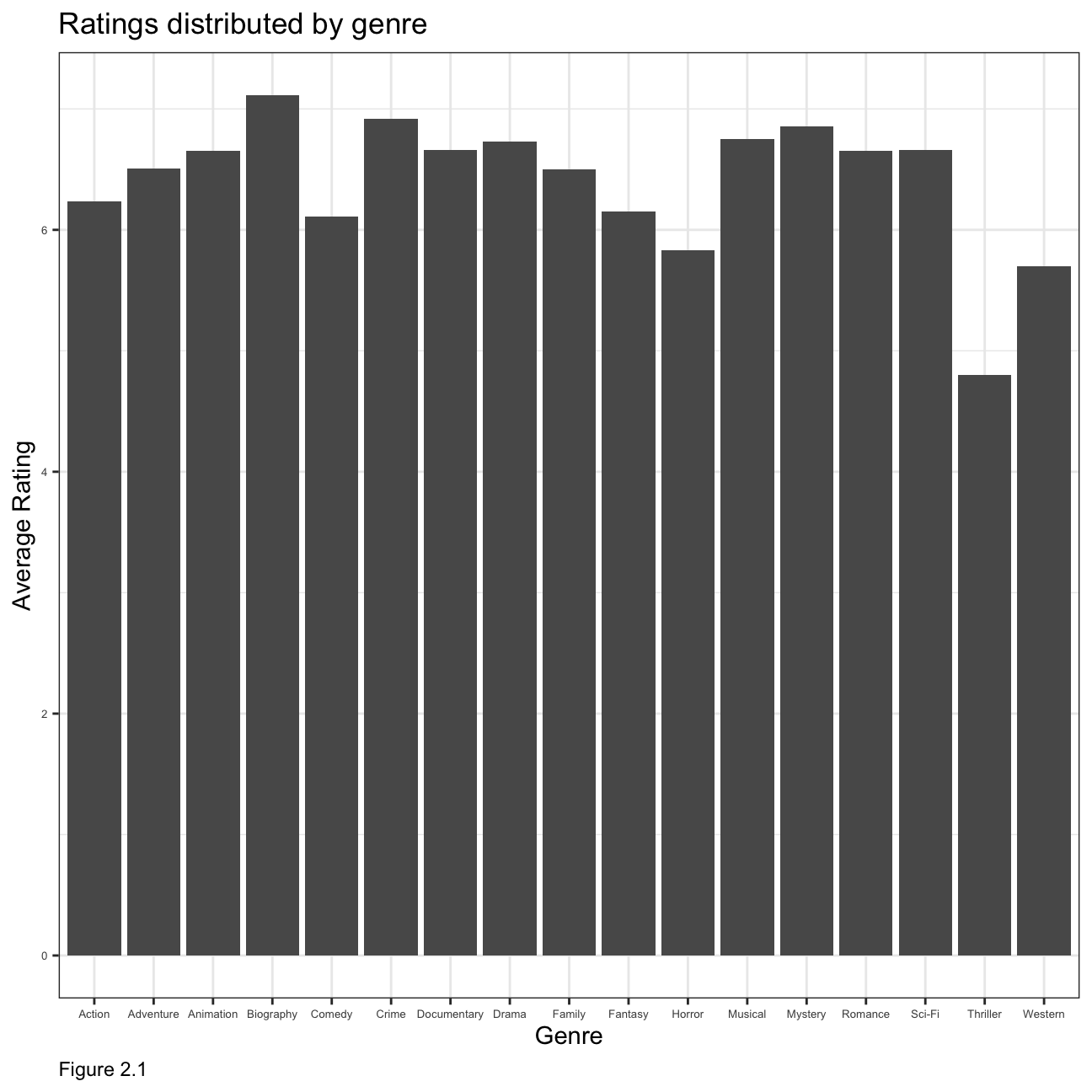
Relationship between gross earnings and cast popularity
ggplot(movies, mapping = aes(
y = gross , x = cast_facebook_likes))+
geom_point() +
labs(caption = "Figure 2.2",
y="Gross",
x="Cast Facebook Likes ",
title = "Relationship b/w Gross Earnings and Cast Popularity",
subtitle = "Scatterplot")+
theme(plot.caption = element_text(hjust = 0))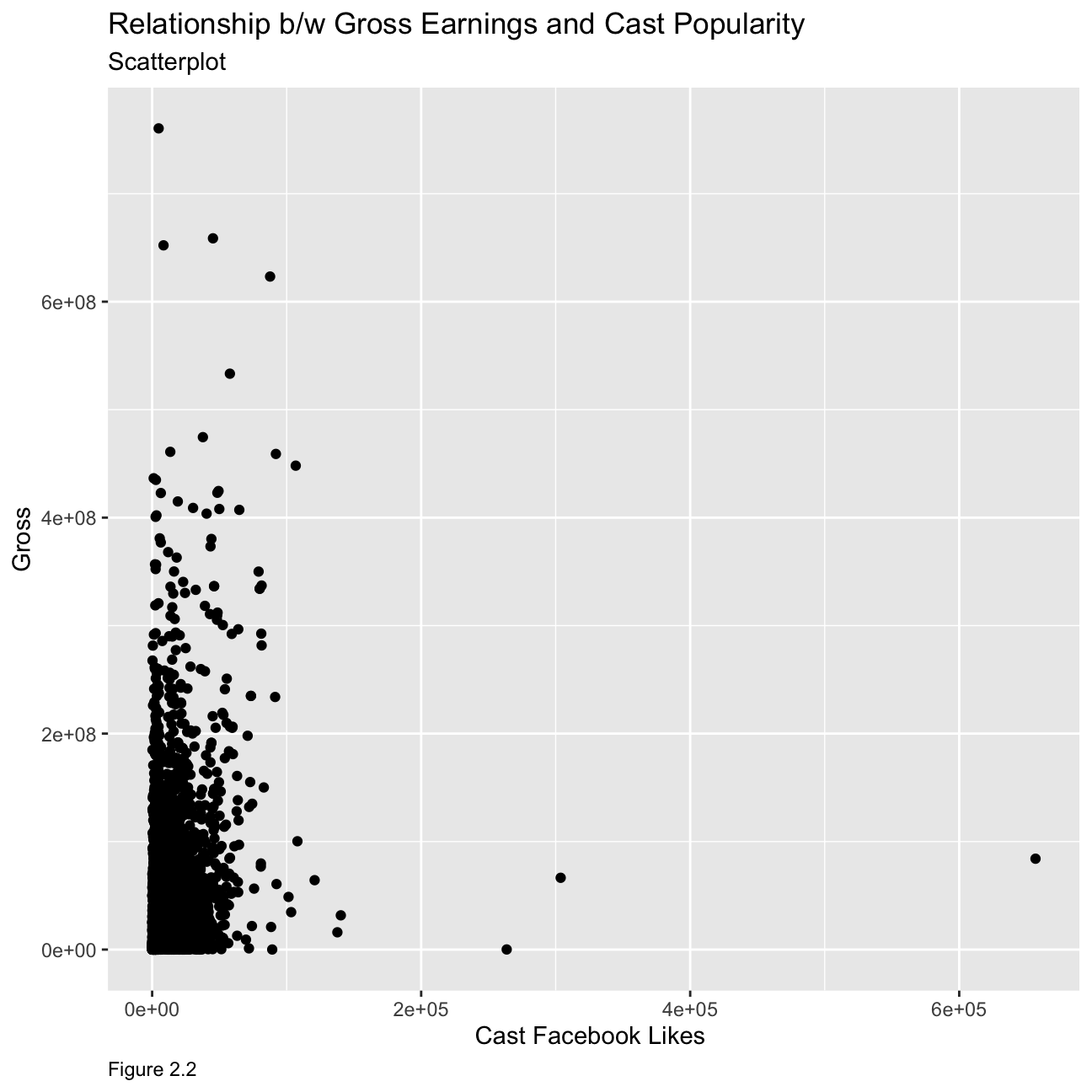 Cast facebook likes is not a good predictor of movie gross profit. As seen from the graph, movies with various gross profit have a similar number of cast facebook likes and there is no apparent relationship between the two variables.
Relationship between gross earnings and budget
ggplot(movies, mapping = aes(
y = gross , x = budget))+
geom_point() +
labs(caption = "Figure 2.3",
y="Gross",
x="Budget ",
title = "Relationship b/w Gross Earnings and Budget",
subtitle = "Scatterplot")+
theme(plot.caption = element_text(hjust = 0))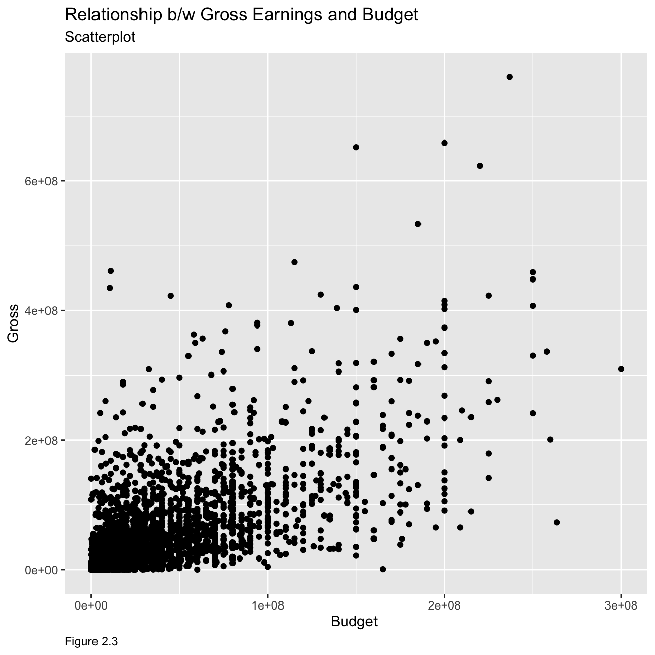 As we can see from the graph, the relationship is much clearer at lower budget where gross is seen to be relatively low as well. However, the relationship seems to be less apparent as budget increases, although the general trend seems to show the gross earnings increasing with increasing budget.
Relationship between gross earnings and ratings
ggplot(movies, mapping = aes(
y = gross , x = rating,colour=budget))+
geom_point() +
facet_wrap(~genre) +
labs(caption = "Figure 2.4",
y="Gross",
x="Rating ",
title = "Relationship b/w Gross Earnings and Ratings",
subtitle = "Scatterplot")+
theme(plot.caption = element_text(hjust = 0))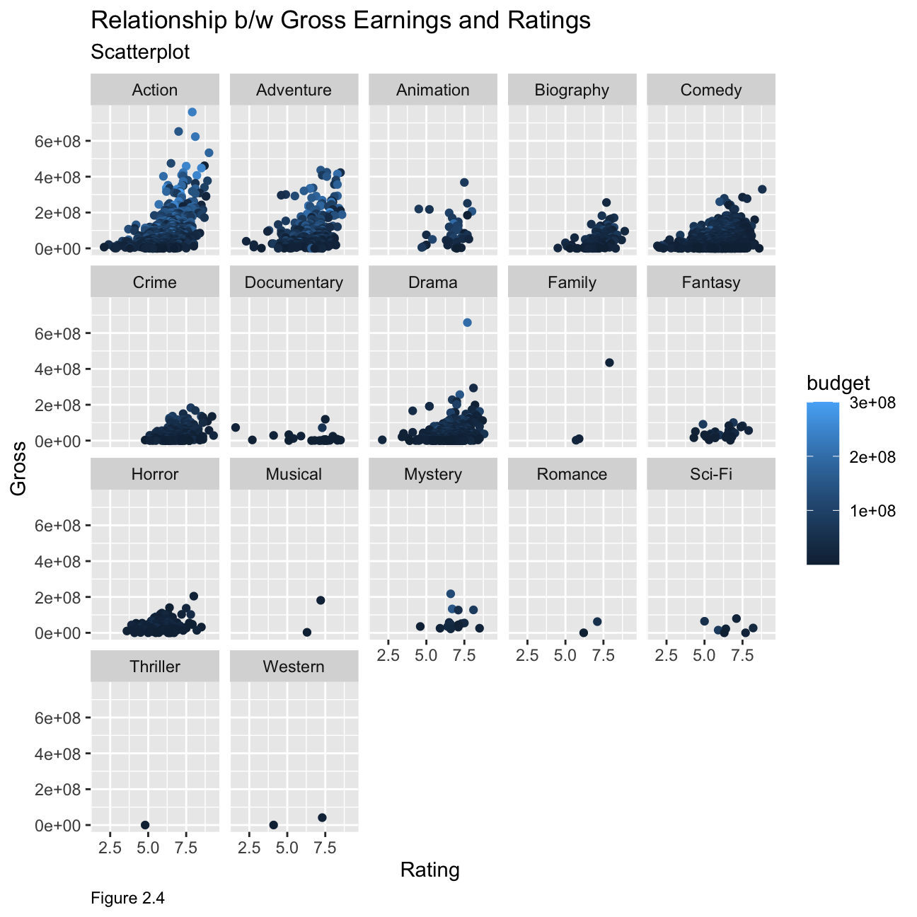 From the data, we can see that for some genres’ the ratings are a good indicator for example action, adventure and comedy have higher gross earnings for movies with higher ratings but this cannot be labelled as the sole indicator. If we map budget as a colour on our plot, we can see that movies with a higher gross behave significantly higher budget combined with higher ratings compared to those with lower ratings and lower gross. However, for most other genres, the rating does not have enough datapoints to give a clear indication of any trends.
Returns of financial stocks
First,we load the nyse dataset from our files.
nyse <- read_csv(here::here("~/Desktop/RR/my_website","nyse.csv"))Based on this dataset, we will now create a table and a bar plot that shows the number of companies per sector, in descending order
nyse1 <- nyse %>%
  group_by(sector) %>%
  count(sort=TRUE)


colnames(nyse1) <- c("Sector","Number of Companies")
nyse1 %>%
  kbl(caption = "Table 3.1") %>%
kable_classic(full_width = F, html_font = "Cambria")| Sector | Number of Companies |
|---|---|
| Finance | 97 |
| Consumer Services | 79 |
| Public Utilities | 60 |
| Capital Goods | 45 |
| Health Care | 45 |
| Energy | 42 |
| Technology | 40 |
| Basic Industries | 39 |
| Consumer Non-Durables | 31 |
| Miscellaneous | 12 |
| Transportation | 10 |
| Consumer Durables | 8 |
nyse1 %>%
  #select(beer_servings) %>%
  slice_max(order_by = `Number of Companies`) %>%
  ggplot(aes(reorder(Sector,- `Number of Companies`),`Number of Companies`)) +
  geom_col()+
  theme_bw()+
  labs(
    title = "Number of Companies by Sector",
    caption= "Figure 3.1",
    x = "Sector",
    y = "Number of Companies"
  )+
  theme(plot.caption = element_text(hjust = 0),
        axis.text = element_text(size=5))+
  NULL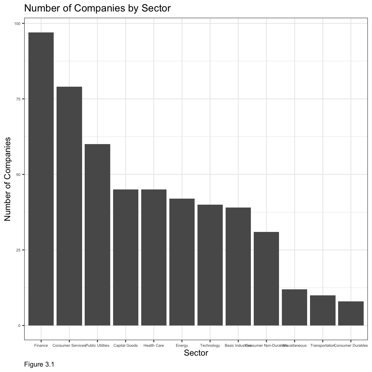
Next, we choose the following six stocks :
Apple (AAPL)
JP Morgan (JPM)
Domino’s Pizza (DPZ)
Tesla (TSLA)
Exxon Mobil (XOM)
SPDR S&P 500 ETF Trust (SPY)
# Notice the cache=TRUE argument in the chunk options. Because getting data is time consuming,
# cache=TRUE means that once it downloads data, the chunk will not run again next time you knit your Rmd

myStocks <- c("AAPL","JPM","DPZ","TSLA","XOM","SPY" ) %>%
  tq_get(get  = "stock.prices",
         from = "2011-01-01",
         to   = "2021-08-31") %>%
  group_by(symbol)

glimpse(myStocks) # examine the structure of the resulting data frame
## Rows: 16,098
## Columns: 8
## Groups: symbol [6]
## $ symbol <chr> "AAPL", "AAPL", "AAPL", "AAPL", "AAPL", "AAPL", "AAPL", "AAPL…
## $ date <date> 2011-01-03, 2011-01-04, 2011-01-05, 2011-01-06, 2011-01-07, …
## $ open <dbl> 11.6, 11.9, 11.8, 12.0, 11.9, 12.1, 12.3, 12.3, 12.3, 12.4, 1…
## $ high <dbl> 11.8, 11.9, 11.9, 12.0, 12.0, 12.3, 12.3, 12.3, 12.4, 12.4, 1…
## $ low <dbl> 11.6, 11.7, 11.8, 11.9, 11.9, 12.0, 12.1, 12.2, 12.3, 12.3, 1…
## $ close <dbl> 11.8, 11.8, 11.9, 11.9, 12.0, 12.2, 12.2, 12.3, 12.3, 12.4, 1…
## $ volume <dbl> 4.45e+08, 3.09e+08, 2.56e+08, 3.00e+08, 3.12e+08, 4.49e+08, 4…
## $ adjusted <dbl> 10.1, 10.2, 10.2, 10.2, 10.3, 10.5, 10.5, 10.6, 10.6, 10.7, 1…#calculate daily returns
myStocks_returns_daily <- myStocks %>%
tq_transmute(select = adjusted,
mutate_fun = periodReturn,
period = "daily",
type = "log",
col_rename = "daily_returns",
cols = c(nested.col))
#calculate monthly returns
myStocks_returns_monthly <- myStocks %>%
tq_transmute(select = adjusted,
mutate_fun = periodReturn,
period = "monthly",
type = "arithmetic",
col_rename = "monthly_returns",
cols = c(nested.col))
#calculate yearly returns
myStocks_returns_annual <- myStocks %>%
group_by(symbol) %>%
tq_transmute(select = adjusted,
mutate_fun = periodReturn,
period = "yearly",
type = "arithmetic",
col_rename = "yearly_returns",
cols = c(nested.col))Next, we create a table to summarise monthly returns for each of the stocks and SPY; min, max, median, mean, SD.
stocks2 <- myStocks_returns_monthly %>%
  group_by(symbol) %>%
  summarise(total_monthly_returns = sum(monthly_returns),
            min_monthly_returns = min(monthly_returns),
            max_monthly_returns = max(monthly_returns),
            average_monthly_returns = mean(monthly_returns),
            median_monthly_returns = median(monthly_returns),
            sd_monthly_returns = sd(monthly_returns))

colnames(stocks2) <- c("Stock Ticker Symbol","Total Monthly Returns", "Minimum Monthly Returns","Maximum Monthly Returns","Average Monthly Returns","Median Monthly Returns","Standard Deviation Monthly Returns")
stocks2 %>%
  kbl(caption = "Table 3.2") %>%
kable_classic(full_width = F, html_font = "Cambria")| Stock Ticker Symbol | Total Monthly Returns | Minimum Monthly Returns | Maximum Monthly Returns | Average Monthly Returns | Median Monthly Returns | Standard Deviation Monthly Returns |
|---|---|---|---|---|---|---|
| AAPL | 3.134 | -0.181 | 0.217 | 0.024 | 0.026 | 0.078 |
| DPZ | 4.016 | -0.188 | 0.342 | 0.031 | 0.025 | 0.075 |
| JPM | 1.943 | -0.229 | 0.202 | 0.015 | 0.022 | 0.072 |
| SPY | 1.576 | -0.125 | 0.127 | 0.012 | 0.017 | 0.038 |
| TSLA | 6.689 | -0.224 | 0.811 | 0.052 | 0.015 | 0.176 |
| XOM | 0.396 | -0.262 | 0.233 | 0.003 | 0.002 | 0.066 |
Now we produce a density plot for each of the stocks along with the mean line for each plot as shown below in Figure 3.2:
mu <-ddply(myStocks_returns_monthly,"symbol", summarise, grp.mean=mean(monthly_returns))
ggplot(myStocks_returns_monthly,aes(x=monthly_returns))+
geom_density()+
facet_wrap(symbol~.)+geom_vline(data=mu, aes(xintercept= grp.mean),color="red",
linetype="dashed",size=1)+
labs(
title = "Density Plot for Monthly Returns by Stock",
subtitle = "Mean Line shown",
caption = "Figure 3.2",
x = "Monthly Return",
y = NULL
)+
theme(plot.caption = element_text(hjust = 0))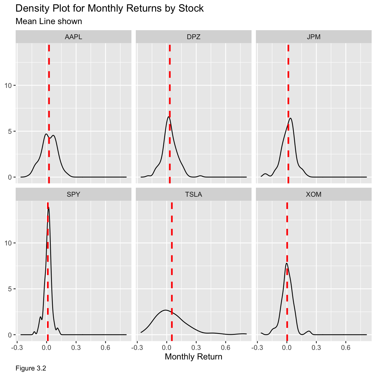 From the table and the plot, we can deduce that Tesla is the riskiest stock and that SPY, being a fund that tracks a stock market index, is the least risky as it includes a collection of stocks with different risk properties. From the mean lines, we can see that SPY and XOM have the least amount of skewness. Hence, those two stocks have a lower variability in monthly return, meaning that they would be the least risky options.
Expected Monthly Return and Standard Deviation of stocks
options(ggrepel.max.overlaps=Inf)
myStocks_returns_monthly %>%
  group_by(symbol) %>%
 summarise(m1 = mean(monthly_returns),m2=sd(monthly_returns)) %>%
  ggplot(aes(y = m1,x=m2)) +
  geom_point()+
  ggrepel::geom_text_repel(aes(label = symbol),
            #         nudge_x = 1,
                     na.rm = FALSE)+
  theme_bw()+
  labs(
    title = "Relationship b/w Expected Monthly Return and Risk of Stocks",
    #subtitle = "Mean Line shown",
    caption = "Figure 3.3",
    y = "Expected Monthly Return",
    x = "Risk (Standard Deviation)"
  )+
  theme(plot.caption = element_text(hjust = 0))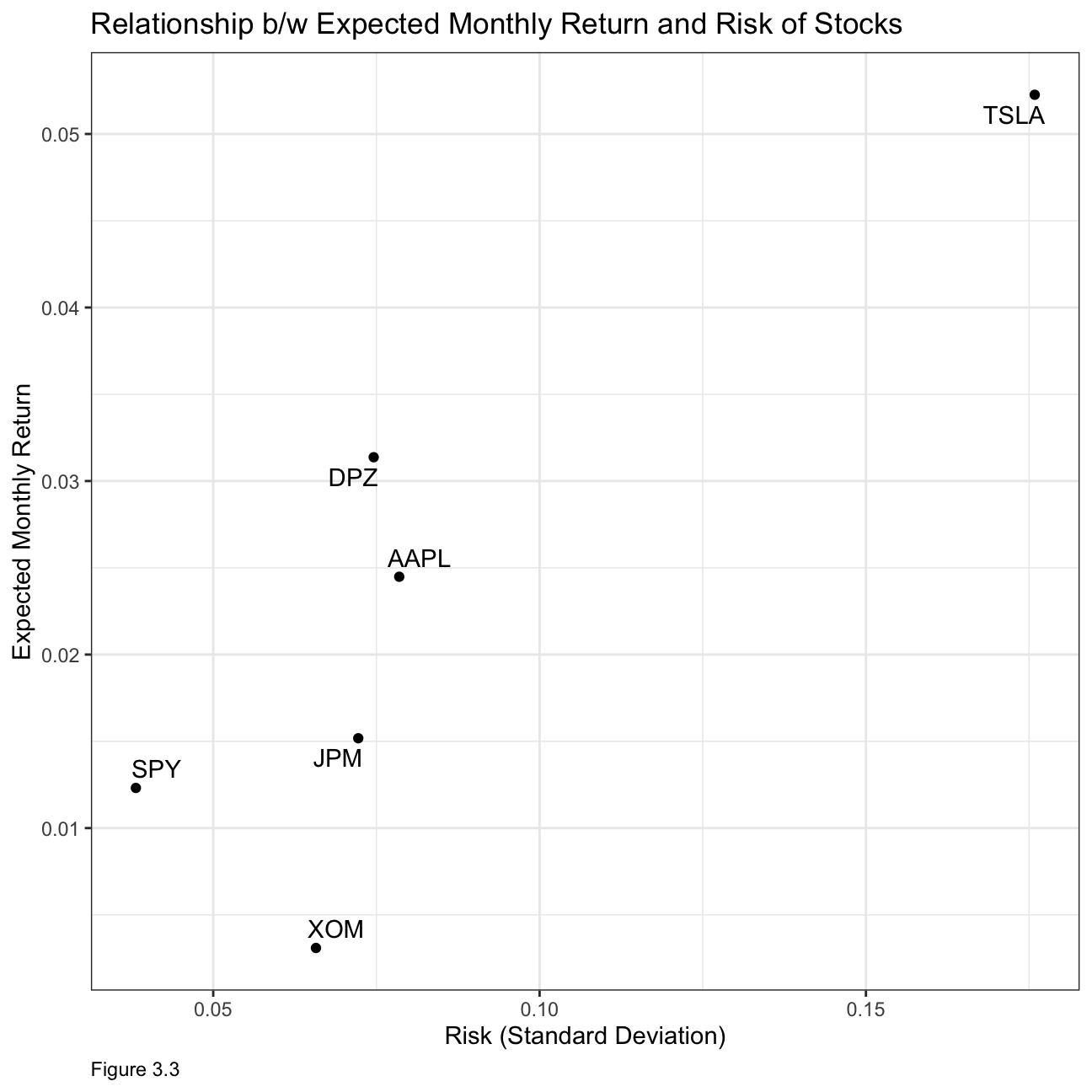
What can you infer from this plot? Are there any stocks which, while being riskier, do not have a higher expected return?
From our previous discussion, XOM and SPY are the least risky stocks however they also seem to have the lowest expected monthly returns. Tesla might be the riskiest but it also has the highest expected monthly return. This illustrates the risk return trade-off which states that potential return will rise with increased risk. However, from this graph, we can see that AAPL has higher risk than DPZ yet has lower expected returns.
(4) IBM HR Analytics
For this task, we will analyse a data set on Human Resource Analytics.
First let us load the data.
hr_dataset <- read_csv(here::here("~/Desktop/RR/my_website", "datasets_1067_1925_WA_Fn-UseC_-HR-Employee-Attrition.csv"))
glimpse(hr_dataset)
We will now clean the data set, as variable names are in capital letters, some variables are not really necessary, and some variables, e.g., education are given as a number rather than a more useful description. The new data is saved in the hr_cleaned dataset.
Firstly, let us look at how often people leave the company. figure 4.1 below shows that most people stay in the company as illustrated by the “No” column.
hr_cleaned %>%
  group_by(attrition) %>%
        tally() %>%
        ggplot(aes(x = attrition, y = n,fill=attrition)) +
        geom_bar(stat = "identity") +
        theme_minimal()+
        labs(x="Attrition", y="Count of Attrition",caption = "Figure 4.1")+
        ggtitle("Attrition in the company")+
  theme(plot.caption = element_text(hjust = 0))+NULL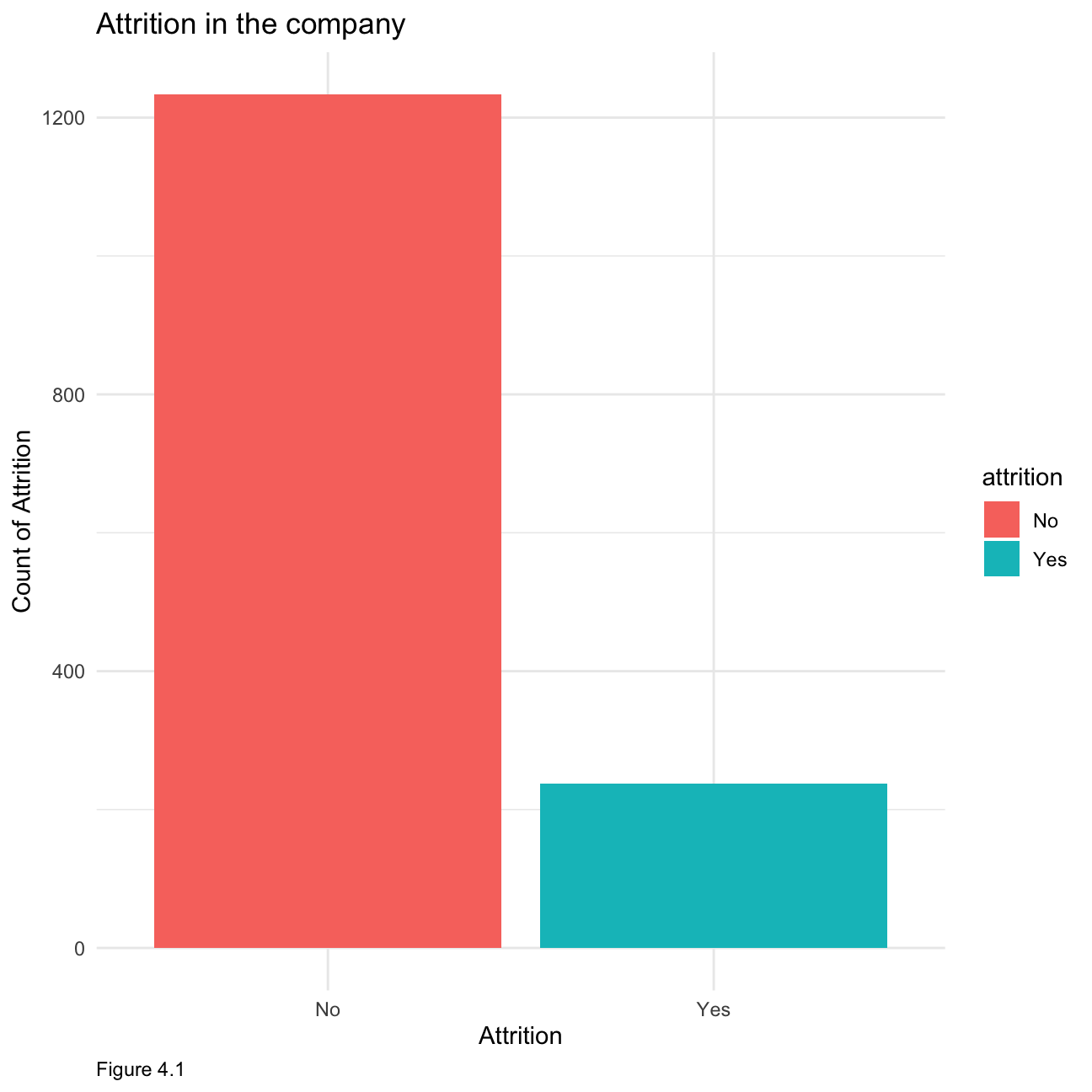
Now let us look at how the age distribution within the company as shown below in Figure 4.2. We can see that the age is relatively normally distributed with most employees falling into the 30 - 40 category.
hr_cleaned %>%
  group_by(age) %>%
  tally() %>%
  ggplot(aes(x = age, y= n, fill =age))+ geom_histogram(stat = "identity") +
        theme_minimal()+
        labs(x="Age", y="Count of Age",caption = "Figure 4.2")+
        ggtitle("Age distribution in the company")+
  theme(plot.caption = element_text(hjust = 0))+NULL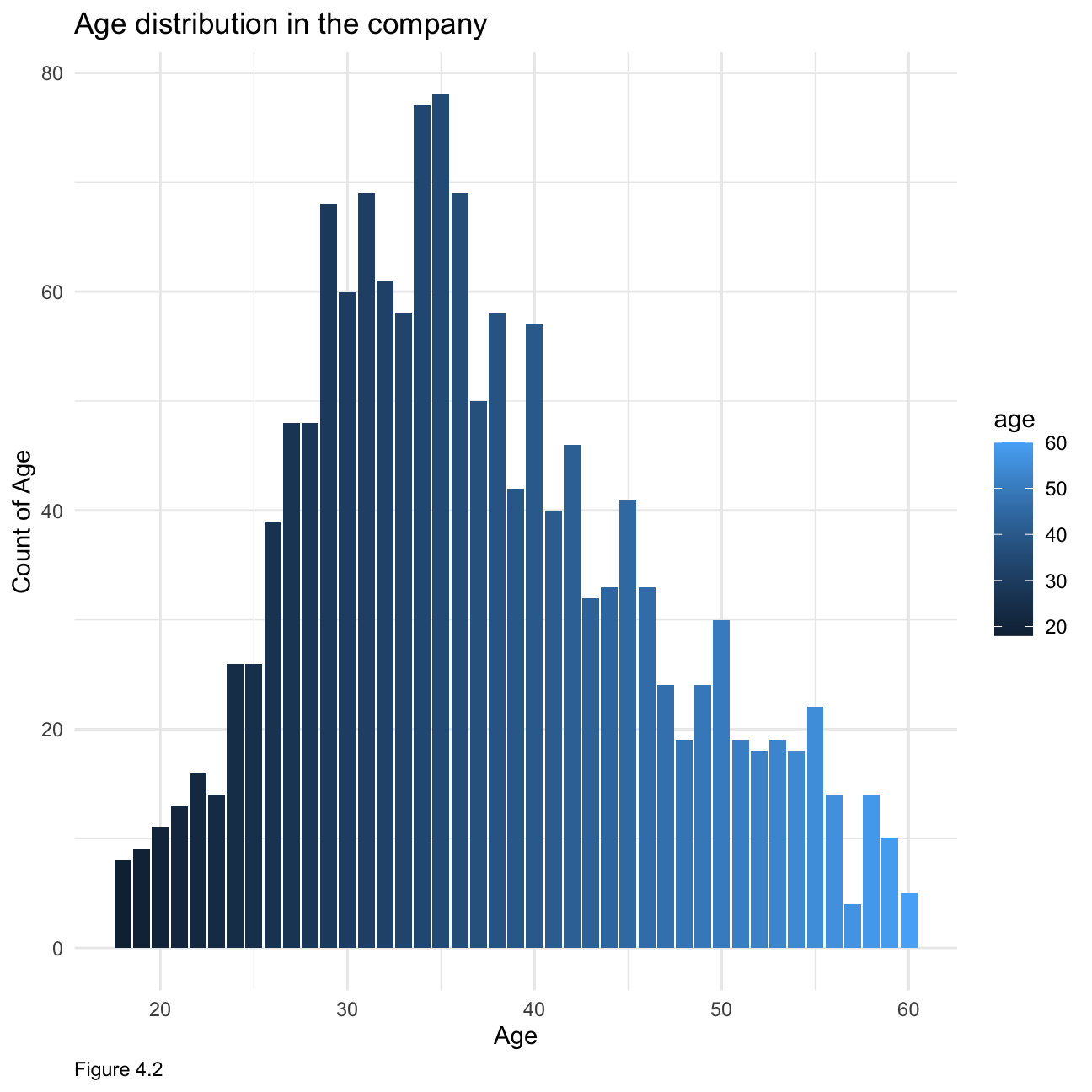
When looking at time spent at the company, Figure 4.3 below is right-skewed showing that most people have not been at the company for more than 10 years.
hr_cleaned %>%
group_by(years_at_company) %>%
tally() %>%
ggplot(aes(x = years_at_company, y= n, fill =years_at_company))+ geom_histogram(stat = "identity") +
theme_minimal()+
labs(x="Years at company", y="Count of Years in the Company",caption = "Figure 4.3")+
ggtitle("Employees years in the company distribution")+
theme(plot.caption = element_text(hjust = 0))+NULL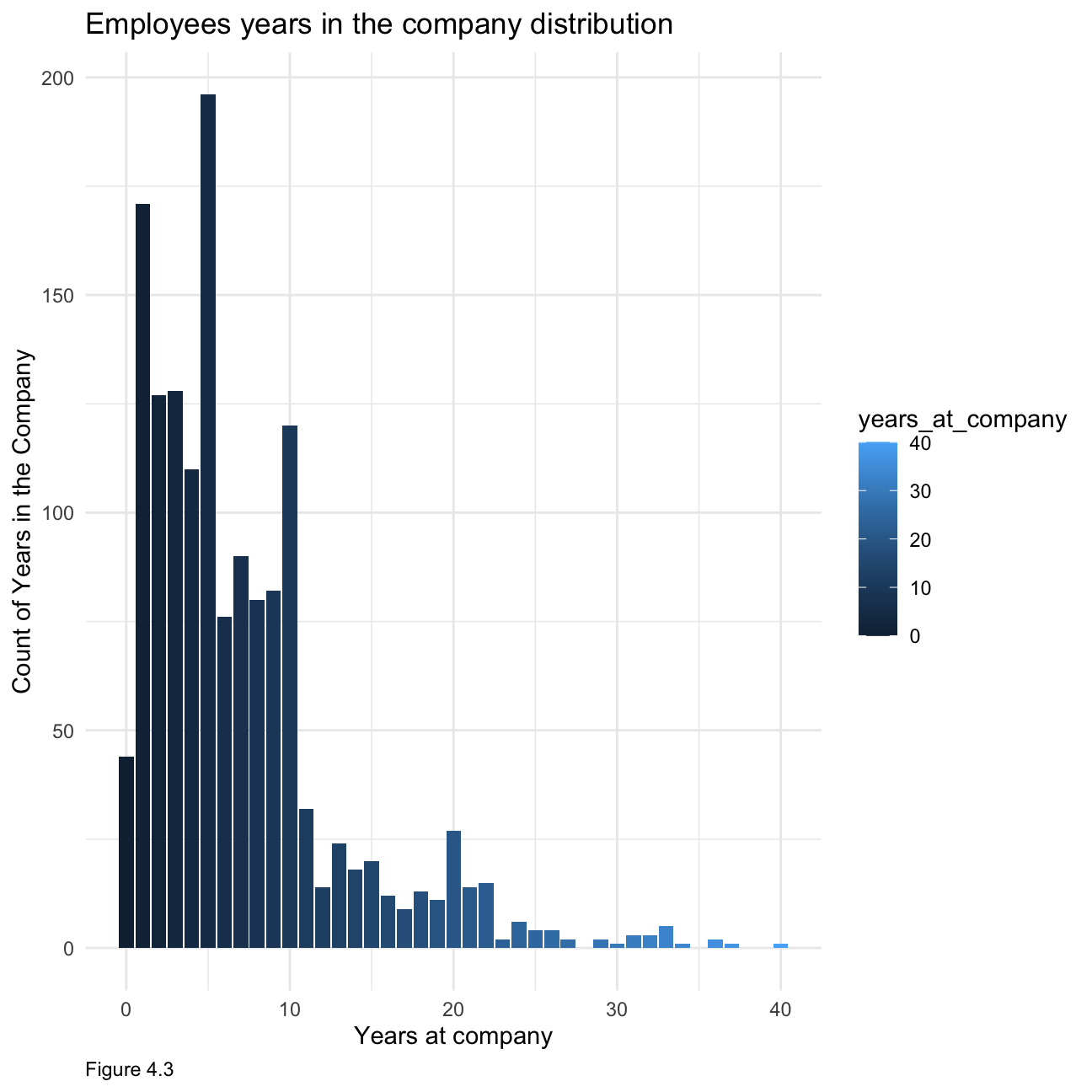 When it comes to monthly income, figure 4.4 below is also right-skewed clearly indicating that most people make below $7000, with relatively fewer people at the higher income spectrum.
ggplot(hr_cleaned, aes(x = monthly_income)) +
  geom_histogram(fill='grey')+
  theme_minimal()+
        labs(x="Monthly income", y="Count of monthly income",caption = "Figure 4.4")+
        ggtitle("Monthly income distribution in the company")+
  theme(plot.caption = element_text(hjust = 0))+ NULL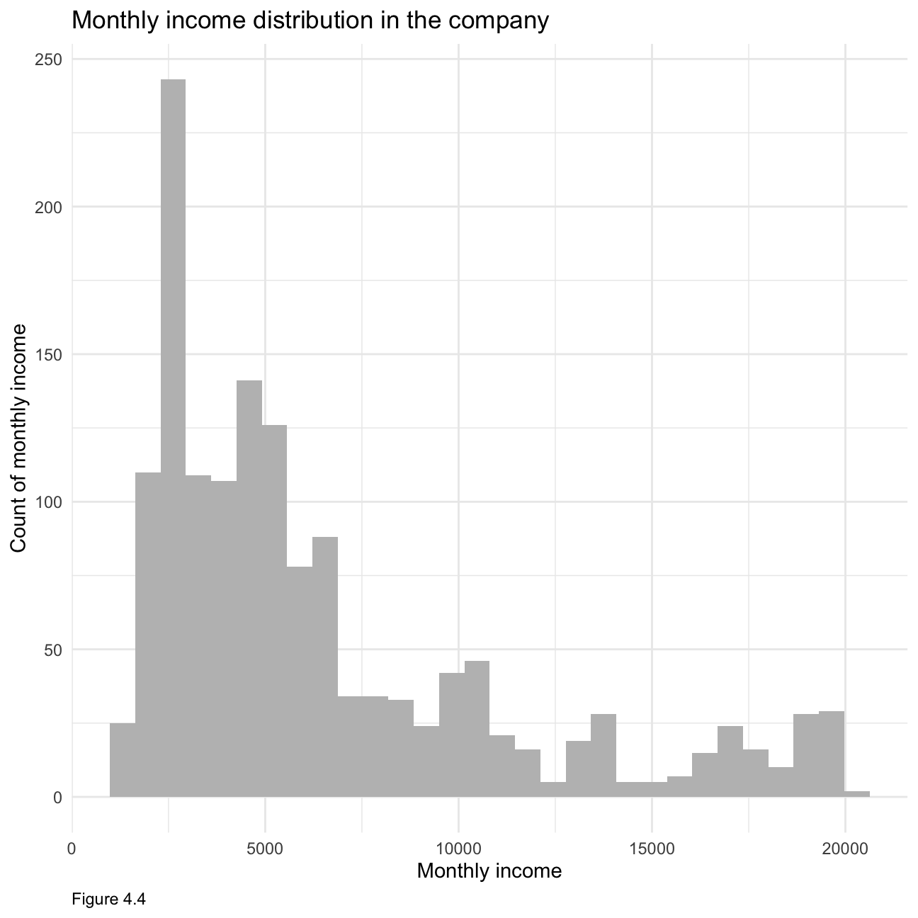
Again, when looking at figure 4.5, it is clearly right-skewed indicating that most people have been recently promoted.
hr_cleaned %>%
  group_by(years_since_last_promotion) %>%
  tally() %>%
  ggplot(aes(x = years_since_last_promotion, y= n, fill =years_since_last_promotion))+ geom_histogram(stat = "identity") +
        theme_minimal()+
        labs(x="Years since last promotion", y="Count of years since last promotion",caption = "Figure 4.5")+
        ggtitle("Years since last promotion distribution in the company")+
  theme(plot.caption = element_text(hjust = 0))+ NULL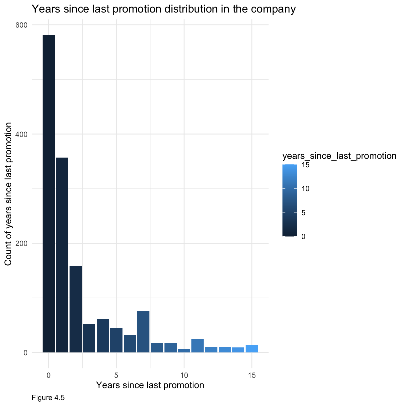
Next, we will look at how job satisfaction and work life balance are distributed. From table 4.1, we can see that most people are relatively satisfied with their jobs, with ~60% reporting high or very high job satisfaction. Similarly, from table 4.2, we can see that most employees are not dissatisfied with their work life balance.
hr1 <- hr_cleaned %>%
  select(job_satisfaction) %>%
  group_by(job_satisfaction) %>%
    count(sort=TRUE)
hr1$Percent <- hr1$n/sum(hr1$n) * 100
colnames(hr1) <- c("Job Satisfaction","Count","Percentage of Count")

hr1[-2] %>%
  kbl(caption = "Table 4.1") %>%
kable_classic(full_width = F, html_font = "Cambria")| Job Satisfaction | Percentage of Count |
|---|---|
| Very High | 31.2 |
| High | 30.1 |
| Low | 19.7 |
| Medium | 19.0 |
hr2 <- hr_cleaned %>%
  select(work_life_balance) %>%
  group_by(work_life_balance) %>%
  count(sort=TRUE)
hr2$Percent <- hr2$n/sum(hr2$n) * 100
colnames(hr2) <- c("Work Life Balances","Count","Percentage of Count")
hr2[-2] %>%
  kbl(caption = "Table 4.2") %>%
kable_classic(full_width = F, html_font = "Cambria")| Work Life Balances | Percentage of Count |
|---|---|
| Better | 60.75 |
| Good | 23.40 |
| Best | 10.41 |
| Bad | 5.44 |
As figure 4.6 shows, generally, with higher education received, people tend to have higher monthly income. Specifically, people who received below college education occupy the most in the low income category (0-5000). People who own doctor education occupy the most in higher income category (15000-20000). As figure 4.7 shows, these two lines (female/male) overlap a lot, but in specific, there are more female than male in the lower income category(0-5000), and more male than female in high income category (17500-20000)
 hr_cleaned %>%
  group_by(education) %>%
  ggplot(aes(x=monthly_income,color=education))+
  #facet_wrap(education~.)+
  geom_density(alpha = 0)+
        theme_minimal()+
        labs(x="Monthly Income", y="Density", caption = "Figure 4.6")+
        ggtitle("Relationship between monthly income and education")+
  theme(plot.caption = element_text(hjust = 0))+ NULL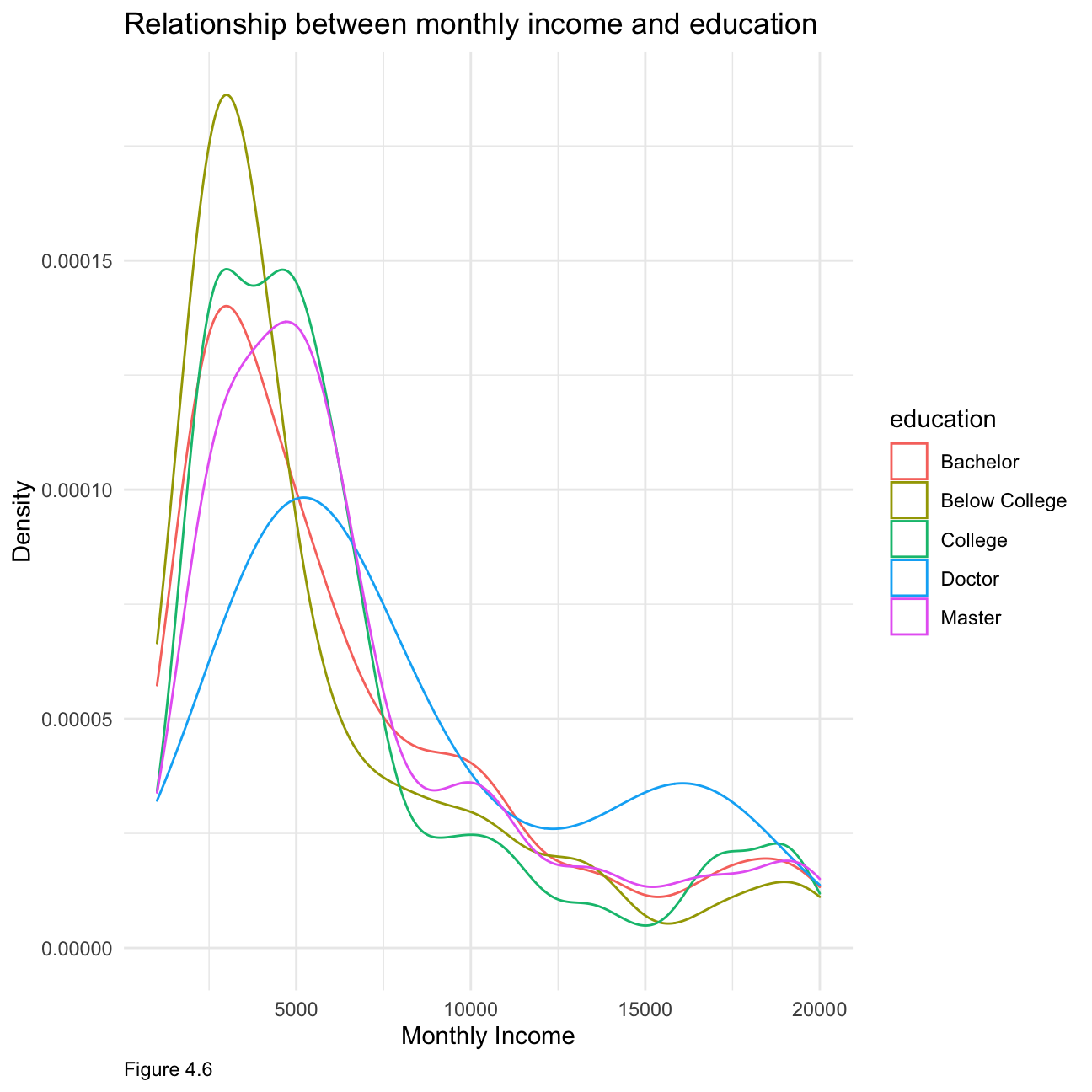
hr_cleaned %>%
  group_by(gender) %>%
  ggplot(aes(x=monthly_income,color=gender))+
  #facet_wrap(education~.)+
  geom_density(alpha = 0)+
        theme_minimal()+
        labs(x="Monthly Income", y="Density",caption = "Figure 4.7")+
        ggtitle("Relationship between monthly income and gender")+
  theme(plot.caption = element_text(hjust = 0))+ NULL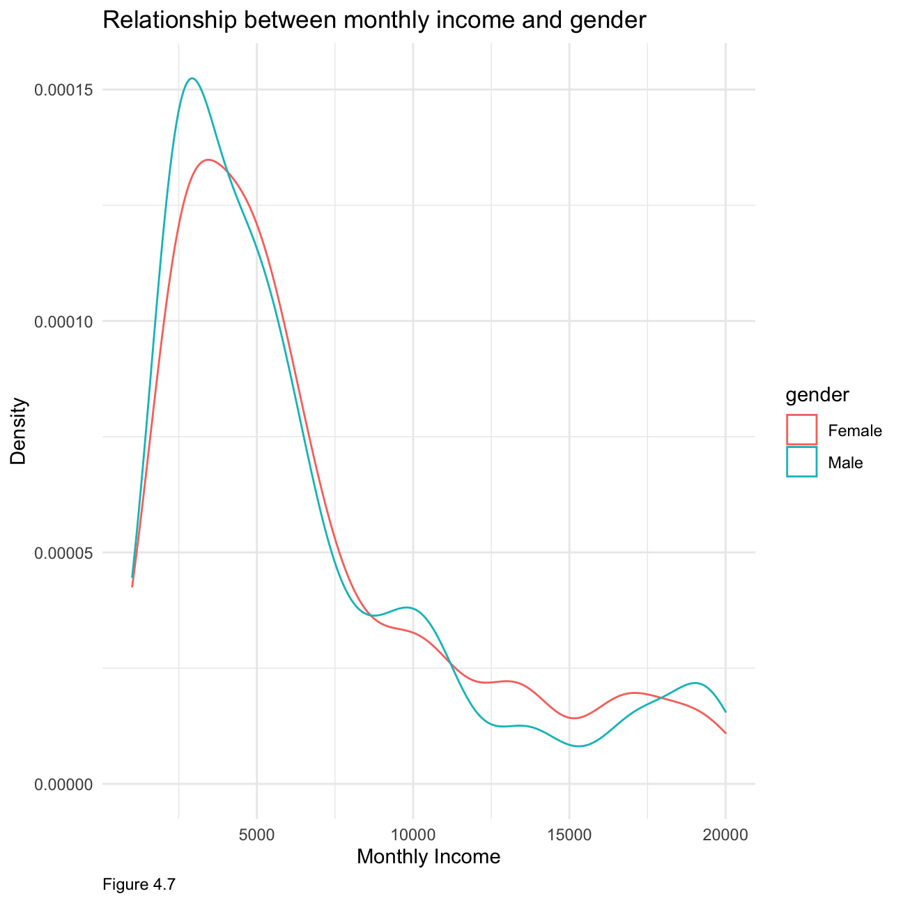
Figure 4.8 below shows that the highest-paying jobs are managers and research directors, with a few outliers. The lowest paying jobs, such as sales representative or laboratory technician are not very spread out whereas jobs in the middle income range have a bigger variability in monthly income.
hr_cleaned %>%
ggplot(aes(x = reorder(job_role,-monthly_income),y=monthly_income,fill=job_role)) +
  geom_boxplot() +
  theme_bw() +
    labs(
     title = "Income Vs Job Role",
     subtitle = "Boxplot",
     x = "Job Role",
     y = "Monthly Income",caption = "Figure 4.8"
    )+
  theme(plot.caption = element_text(hjust = 0),
        axis.text = element_text(size=5))+
NULL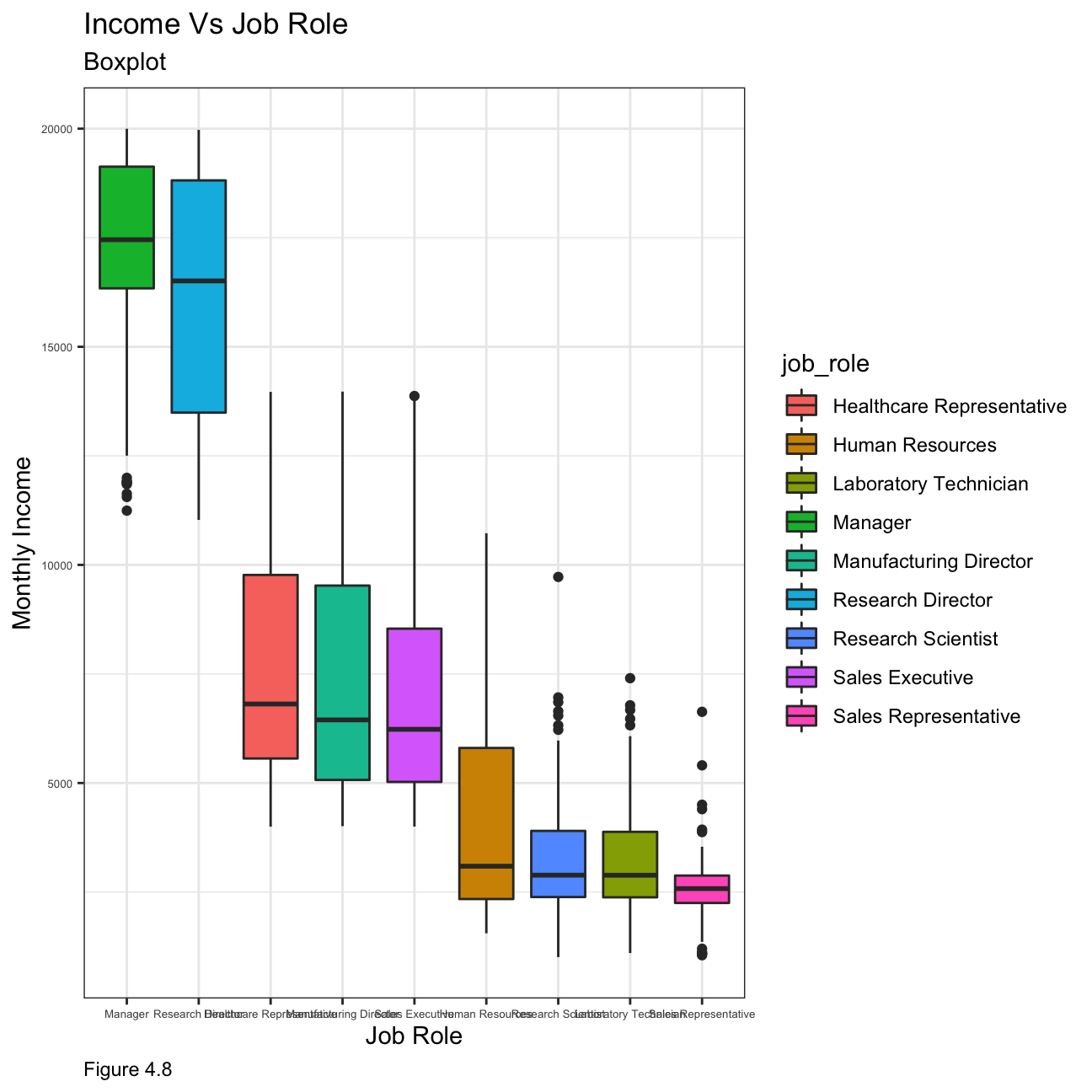
In order to compare income by education level, we look at the median values as the mean is influenced by extreme values and is not an accurate enough representation of the salary level that could be expected. Figure 4.10 showcases that people with a doctorate have the highest median income, whilst people with a below college education have the lowest.
hr_cleaned %>%
  group_by(education) %>%
  summarise(mean=mean(monthly_income)) %>%
  ggplot(aes(x = education, y=mean)) +
  geom_col(fill='blue') +
  labs(x="Education level", y="Income",caption = "Figure 4.9")+
  ggtitle("Mean income by education level")+
  theme(plot.caption = element_text(hjust = 0))+ NULL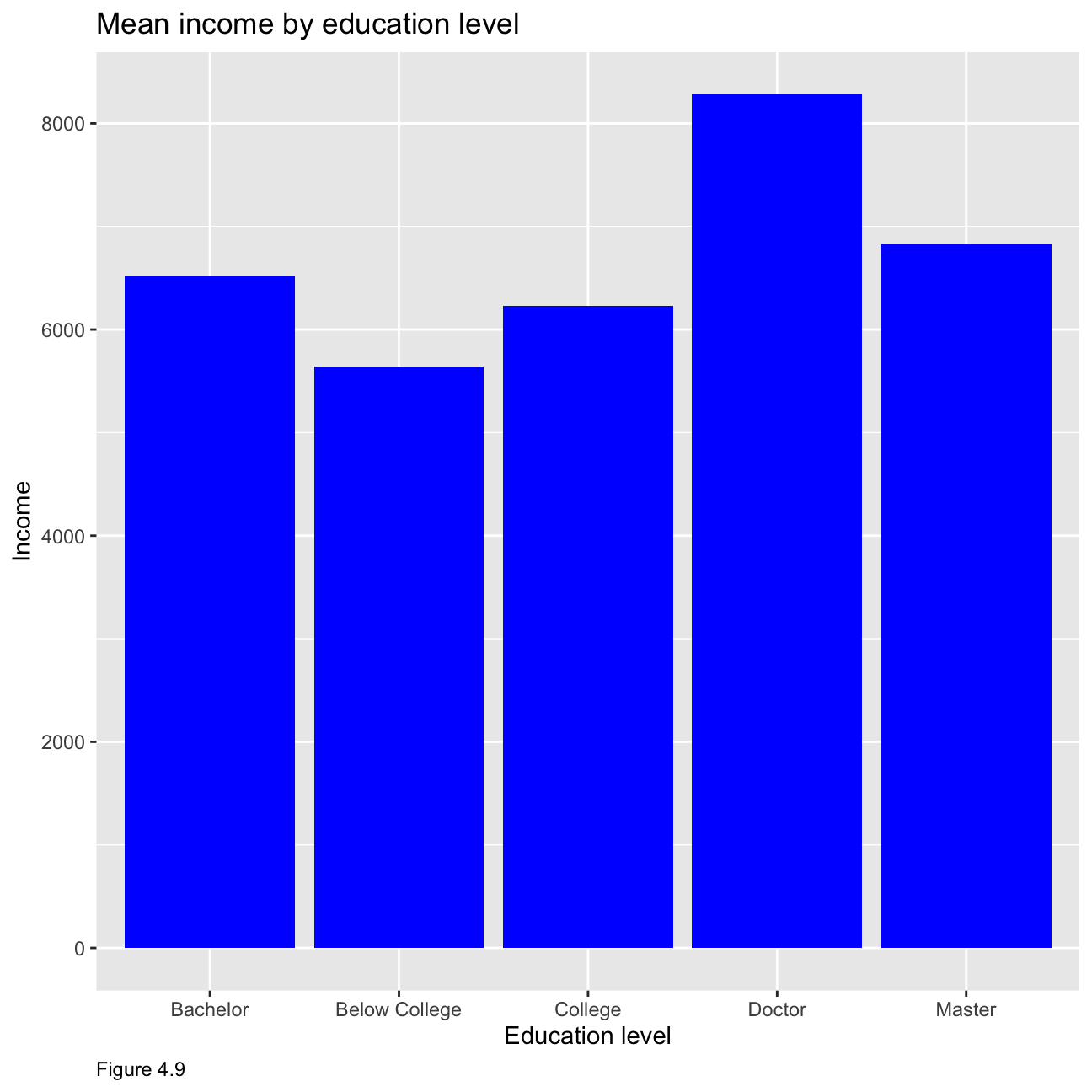
hr_cleaned %>%
  group_by(education) %>%
  summarise(median=median(monthly_income)) %>%
  ggplot(aes(x = education, y=median)) +
  geom_col(fill='red') +
  labs(x="Education level", y="Income",caption = "Figure 4.10")+
  ggtitle("Median income by education level")+
  theme(plot.caption = element_text(hjust = 0))+ NULL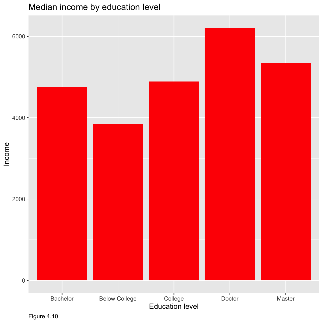
As figure 4.11 below shows, although data is limited in Doctor category, all these five graphs have right skewed distribution. This means that, in all education levels, the higher the monthly income, the smaller the number of people.
hr_cleaned %>%
  mutate(
    education = fct_reorder(education, monthly_income, mean)
  ) %>%
  group_by(education) %>%
  ggplot(aes(x = monthly_income)) +
  geom_histogram() +
  facet_wrap(education~.) +
  theme_economist() +
     theme(legend.position = "none",
           axis.title.x = element_text()) +
  labs(x="Monthly Income", y="Density",caption = "Figure 4.11")+
  ggtitle("Distribution of income by education level")+
  theme(plot.caption = element_text(hjust = 0))+
  NULL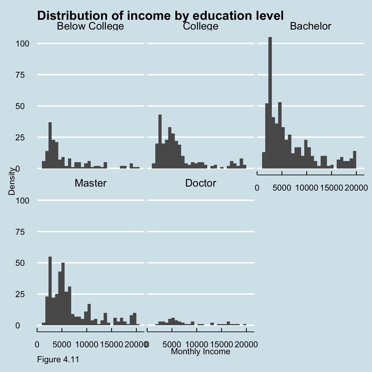
Figure 4.12 below shows the relationship between income and age by job category. For example, for sales associates, the salary is higher at a younger age presumably due to the nature of the job. While manager’s salary seems to increase to an extent with age.
ggplot(hr_cleaned, mapping = aes(
   y = monthly_income  , x = age))+
   geom_col() +
   facet_wrap(~job_role) +
   labs(caption = "Figure 4.12",
       y="Monthly Income",
       x="Age ",
       title = "Income vs Age"
      )+
  theme(plot.caption = element_text(hjust = 0))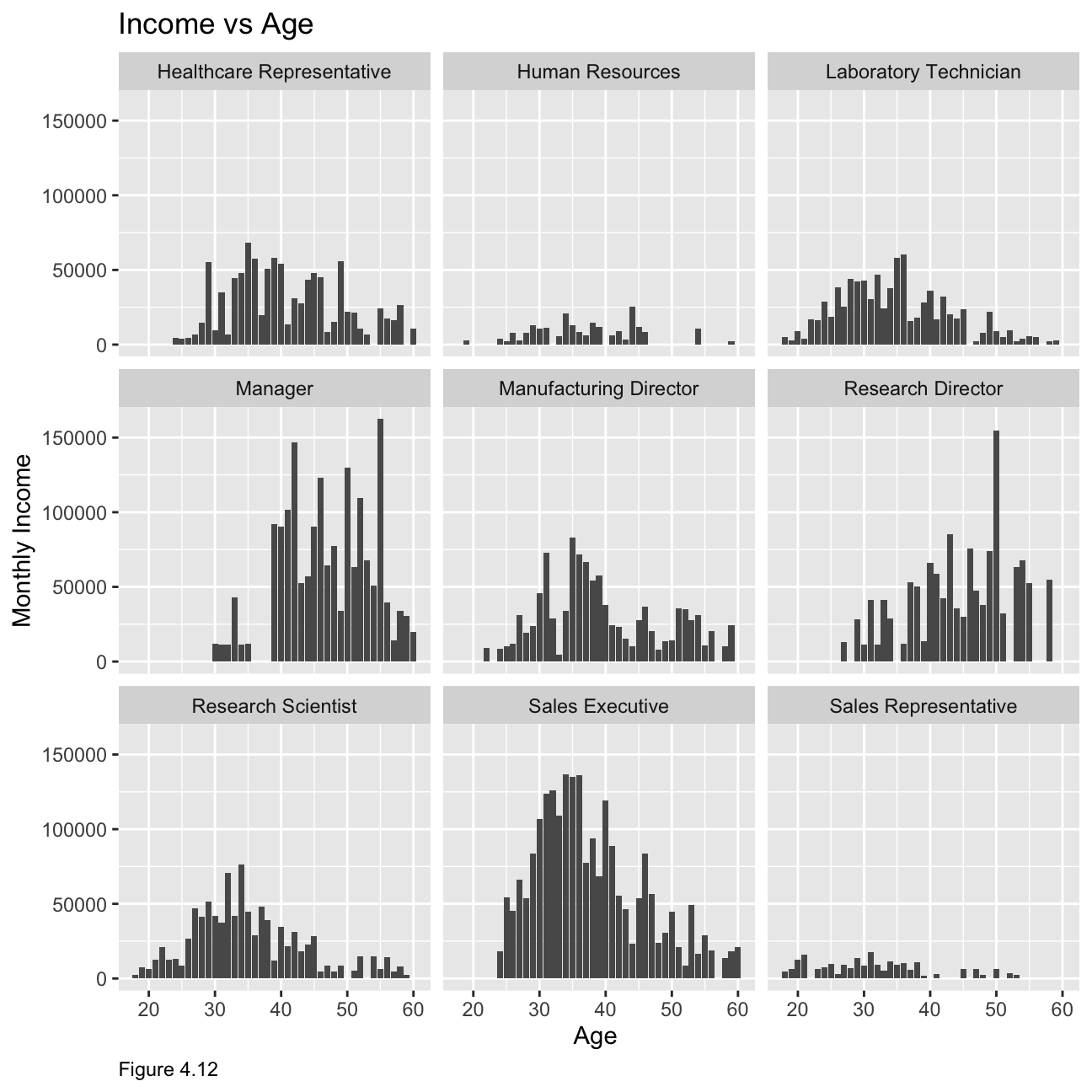
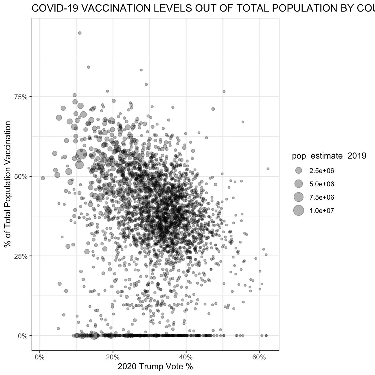
Challenge: Replicating a chart
The purpose of this exercise is to reproduce a plot which can be found below.
# Download CDC vaccination by county
cdc_url <- "https://data.cdc.gov/api/views/8xkx-amqh/rows.csv?accessType=DOWNLOAD"
vaccinations <- vroom(cdc_url) %>%
  janitor::clean_names() %>%
  filter(fips != "UNK") # remove counties that have an unknown (UNK) FIPS code

# Download County Presidential Election Returns
# https://dataverse.harvard.edu/dataset.xhtml?persistentId=doi:10.7910/DVN/VOQCHQ
election2020_results <- vroom(here::here("~/Desktop/RR/my_website", "countypres_2000-2020.csv")) %>%
  janitor::clean_names() %>%

  # just keep the results for the 2020 election
  filter(year == "2020") %>%

  # change original name county_fips to fips, to be consistent with the other two files
  rename (fips = county_fips)

# Download county population data
population_url <- "https://www.ers.usda.gov/webdocs/DataFiles/48747/PopulationEstimates.csv?v=2232"
population <- vroom(population_url) %>%
  janitor::clean_names() %>%

  # select the latest data, namely 2019
  select(fips = fip_stxt, pop_estimate_2019) %>%

  # pad FIPS codes with leading zeros, so they are always made up of 5 characters
  mutate(fips = stringi::stri_pad_left(fips, width=5, pad = "0"))

#create trump table
trump_vote <- election2020_results %>%
  group_by(fips) %>%
  filter(candidate == "DONALD J TRUMP") %>%
  summarise(votes = sum(candidatevotes)*100)

# create vaccination table
vaccination_number <- vaccinations %>%
  filter(date == '09/02/2021') %>%
  group_by(fips) %>%
  select(fips, series_complete_yes) %>%
  summarise(series_complete_yes = sum(series_complete_yes)*100)

# create full table
full_table <- left_join(vaccination_number, trump_vote, by = 'fips') %>%
  left_join(population, by = 'fips') %>%
  mutate(vaccination_rate = series_complete_yes/pop_estimate_2019, trump_vote_rate = votes/pop_estimate_2019) %>%
  filter(vaccination_rate <= 100, trump_vote_rate<= 100)

# reproduce graph
full_table %>% ggplot(aes(x = trump_vote_rate, y = vaccination_rate, size = pop_estimate_2019)) +
  geom_point(alpha = 0.3) +
  scale_y_continuous(labels = scales::percent_format(scale = 1)) +
  scale_x_continuous(labels = scales::percent_format(scale = 1)) +
  theme_bw() +
    labs(
     title = "COVID-19 VACCINATION LEVELS OUT OF TOTAL POPULATION BY COUNTY",
     x = "2020 Trump Vote %",
     y = "% of Total Population Vaccination"
    )+
  theme(plot.caption = element_text(hjust = 0))