group project

library(tidyverse)  # Load ggplot2, dplyr, and all the other tidyverse packages
library(mosaic)
library(ggthemes)
library(GGally)
library(readxl)
library(here)
library(skimr)
library(janitor)
library(broom)
library(tidyquant)
library(infer)
library(openintro)
library(kableExtra)
Youth Risk Behavior Surveillance
Every two years, the Centers for Disease Control and Prevention conduct the Youth Risk Behavior Surveillance System (YRBSS) survey, where it takes data from high schoolers (9th through 12th grade), to analyze health patterns. You will work with a selected group of variables from a random sample of observations during one of the years the YRBSS was conducted.
Load the data
This data is part of the openintro textbook and we can load and inspect it. There are observations on 13 different variables, some categorical and some numerical. The meaning of each variable can be found by bringing up the help file:
data(yrbss)
glimpse(yrbss)
## Rows: 13,583
## Columns: 13
## $ age <int> 14, 14, 15, 15, 15, 15, 15, 14, 15, 15, 15, 1…
## $ gender <chr> "female", "female", "female", "female", "fema…
## $ grade <chr> "9", "9", "9", "9", "9", "9", "9", "9", "9", …
## $ hispanic <chr> "not", "not", "hispanic", "not", "not", "not"…
## $ race <chr> "Black or African American", "Black or Africa…
## $ height <dbl> NA, NA, 1.73, 1.60, 1.50, 1.57, 1.65, 1.88, 1…
## $ weight <dbl> NA, NA, 84.4, 55.8, 46.7, 67.1, 131.5, 71.2, …
## $ helmet_12m <chr> "never", "never", "never", "never", "did not …
## $ text_while_driving_30d <chr> "0", NA, "30", "0", "did not drive", "did not…
## $ physically_active_7d <int> 4, 2, 7, 0, 2, 1, 4, 4, 5, 0, 0, 0, 4, 7, 7, …
## $ hours_tv_per_school_day <chr> "5+", "5+", "5+", "2", "3", "5+", "5+", "5+",…
## $ strength_training_7d <int> 0, 0, 0, 0, 1, 0, 2, 0, 3, 0, 3, 0, 0, 7, 7, …
## $ school_night_hours_sleep <chr> "8", "6", "<5", "6", "9", "8", "9", "6", "<5"…Before you carry on with your analysis, it’s is always a good idea to check with skimr::skim() to get a feel for missing values, summary statistics of numerical variables, and a very rough histogram.
Exploratory Data Analysis
You will first start with analyzing the weight of participants in kilograms. Using visualization and summary statistics, describe the distribution of weights. How many observations are we missing weights from?
skim(yrbss)| Name | yrbss |
| Number of rows | 13583 |
| Number of columns | 13 |
| _______________________ | |
| Column type frequency: | |
| character | 8 |
| numeric | 5 |
| ________________________ | |
| Group variables | None |
Variable type: character
| skim_variable | n_missing | complete_rate | min | max | empty | n_unique | whitespace |
|---|---|---|---|---|---|---|---|
| gender | 12 | 1.00 | 4 | 6 | 0 | 2 | 0 |
| grade | 79 | 0.99 | 1 | 5 | 0 | 5 | 0 |
| hispanic | 231 | 0.98 | 3 | 8 | 0 | 2 | 0 |
| race | 2805 | 0.79 | 5 | 41 | 0 | 5 | 0 |
| helmet_12m | 311 | 0.98 | 5 | 12 | 0 | 6 | 0 |
| text_while_driving_30d | 918 | 0.93 | 1 | 13 | 0 | 8 | 0 |
| hours_tv_per_school_day | 338 | 0.98 | 1 | 12 | 0 | 7 | 0 |
| school_night_hours_sleep | 1248 | 0.91 | 1 | 3 | 0 | 7 | 0 |
Variable type: numeric
| skim_variable | n_missing | complete_rate | mean | sd | p0 | p25 | p50 | p75 | p100 | hist |
|---|---|---|---|---|---|---|---|---|---|---|
| age | 77 | 0.99 | 16.16 | 1.26 | 12.00 | 15.0 | 16.00 | 17.00 | 18.00 | ▁▂▅▅▇ |
| height | 1004 | 0.93 | 1.69 | 0.10 | 1.27 | 1.6 | 1.68 | 1.78 | 2.11 | ▁▅▇▃▁ |
| weight | 1004 | 0.93 | 67.91 | 16.90 | 29.94 | 56.2 | 64.41 | 76.20 | 180.99 | ▆▇▂▁▁ |
| physically_active_7d | 273 | 0.98 | 3.90 | 2.56 | 0.00 | 2.0 | 4.00 | 7.00 | 7.00 | ▆▂▅▃▇ |
| strength_training_7d | 1176 | 0.91 | 2.95 | 2.58 | 0.00 | 0.0 | 3.00 | 5.00 | 7.00 | ▇▂▅▂▅ |
favstats(~weight, data=yrbss) %>%
  kbl(caption = "Table 1.1 ") %>%
kable_classic(full_width = F, html_font = "Cambria")| min | Q1 | median | Q3 | max | mean | sd | n | missing | |
|---|---|---|---|---|---|---|---|---|---|
| 29.9 | 56.2 | 64.4 | 76.2 | 181 | 67.9 | 16.9 | 12579 | 1004 |
ggplot(yrbss,aes(weight))+
  geom_histogram()+
  labs(caption="Data visualisation for weight distribution")+
  theme(plot.caption = element_text(hjust = 0))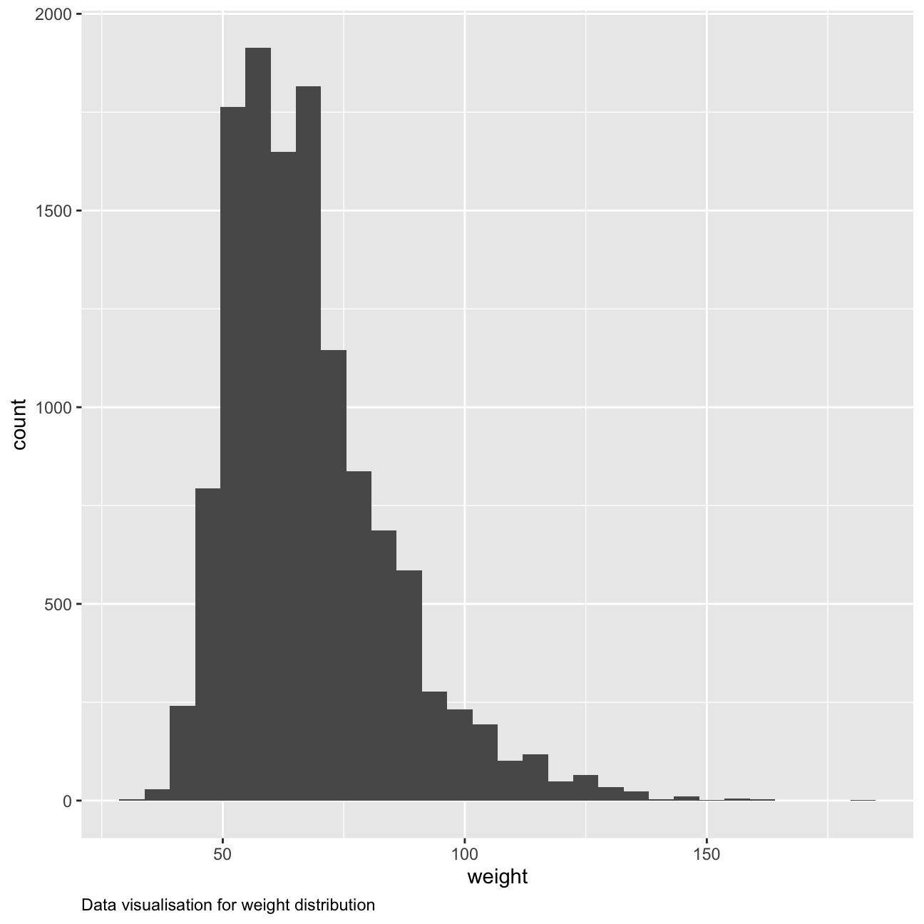
The distribution for weight in kilograms is positively skewed with a tail on the right side, illustrating how most values remain between 56.2 (Q1) and 76.3 (Q3) with a mean of 67.9 and standard deviation of 16.9, while there are some values that are much higher such as the maximum weight of 181 kg. There are 1004 missing observations.
Next, we consider the possible relationship between a high schooler’s weight and their physical activity. Plotting the data is a useful first step because it helps us quickly visualize trends, identify strong associations, and develop research questions.
We create a new variable in the dataframe yrbss, called physical_3plus , which will be yes if they are physically active for at least 3 days a week, and no otherwise. You may also want to calculate the number and % of those who are and are not active for more than 3 days. RUse the count() function and see if you get the same results as group_by()... summarise()
The two tables below show the count using both methods. Table 1.3 shows this with the group by method. The proportions have also been calculated and shown.
yrbss2 <-  yrbss %>%
  mutate(physical_3plus = case_when(physically_active_7d >= 3~"yes",
         physically_active_7d  < 3~"no")) %>%
  drop_na(physical_3plus)

yrbss2 %>%
  count(physical_3plus,sort=TRUE) %>%
  mutate(proportion = n/sum(n)) %>%
  kbl(caption = "Table 1.2: Count and proportions ") %>%
kable_classic(full_width = F, html_font = "Cambria")| physical_3plus | n | proportion |
|---|---|---|
| yes | 8906 | 0.669 |
| no | 4404 | 0.331 |
# group by and summarise method

yrbss %>%
 mutate(physical_3plus = case_when(physically_active_7d >= 3~"yes",
 physically_active_7d  < 3~"no")) %>%
   drop_na(physical_3plus) %>%
 group_by(physical_3plus) %>%
  count() %>%
  kbl(caption = "Table 1.3: Count using group by method ") %>%
kable_classic(full_width = F, html_font = "Cambria")| physical_3plus | n |
|---|---|
| no | 4404 |
| yes | 8906 |
The answer is the same for both methods as we can see above.
95% confidence interval for the population proportion of high schools that are NOT active 3 or more days per week:
library(infer)
library(kableExtra)

set.seed(1234)

ci_prophighschool_notactive<-yrbss2 %>%
  filter(grade>=9,physical_3plus != "NA") %>%
  specify(response=physical_3plus,success="no") %>%
  generate(reps=1000, type="bootstrap") %>%
  calculate(stat="prop")


bootstrap_ci <- ci_prophighschool_notactive %>%
  get_ci(level=0.95, type="percentile")

colnames(bootstrap_ci) = c("Lower CI","Upper CI")

bootstrap_ci %>%
  kbl(caption = "Table 1.4 ") %>%
kable_classic(full_width = F, html_font = "Cambria")| Lower CI | Upper CI |
|---|---|
| 0.282 | 0.313 |
Boxplot of physical_3plus vs. weight. Is there a relationship between these two variables? What did you expect and why?
yrbss2 %>%
select(physical_3plus,weight) %>%
drop_na(physical_3plus,weight) %>%
ggplot(aes(physical_3plus,weight))+geom_boxplot()+
labs(x="Physically Active for more than 3 days",
y= "Weight",
caption = "Figure 1.1")+
theme(plot.caption = element_text(hjust=0))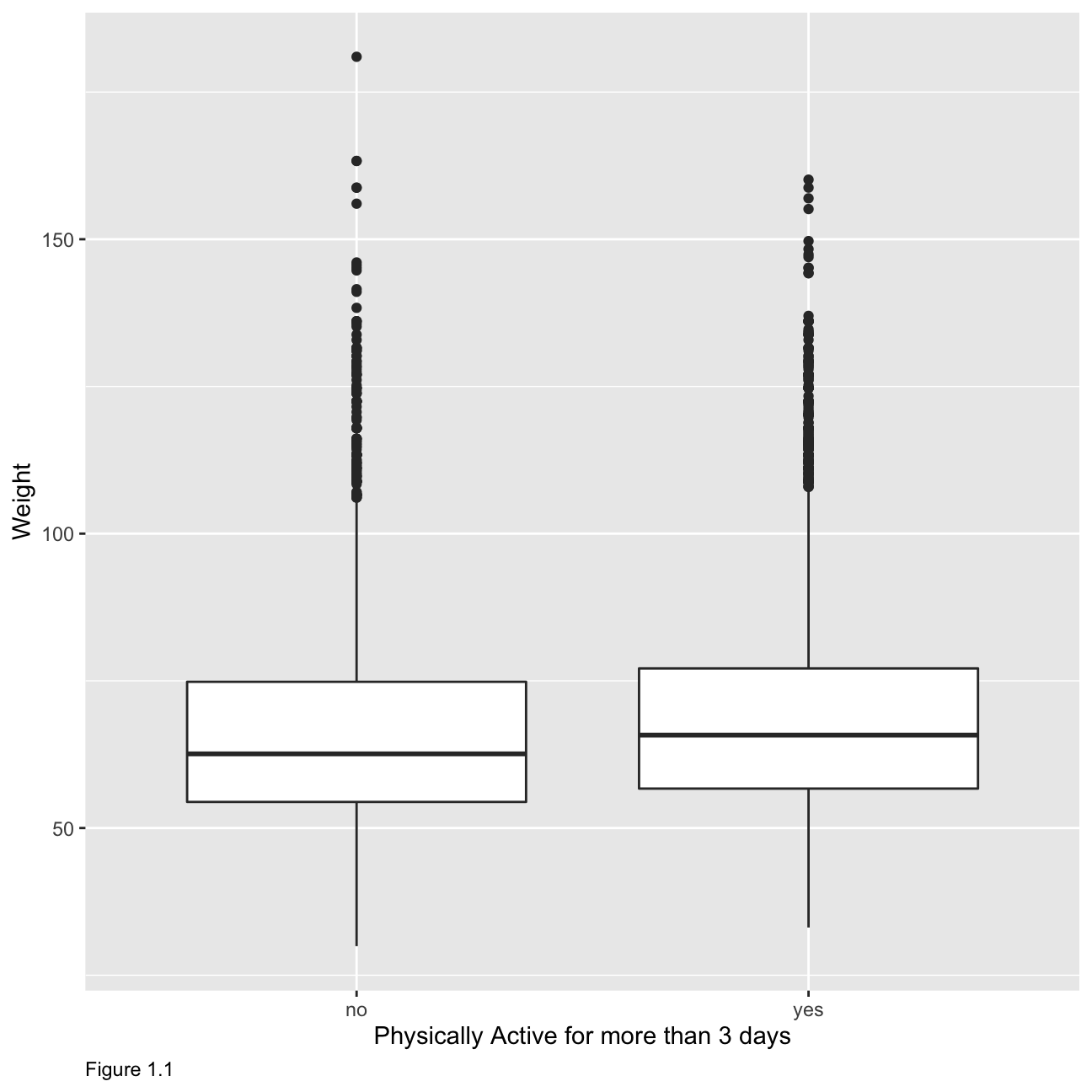 While it might be a bit surprising, we observe no strong relationship between weight and whether students are physically active for more than 3 days. Figure 1.1 shows that the mean weight is higher for students who are more physically active which seems counter intuitive if we think about overweight students who do not exercise but it might be because students do weight training and have more muscle mass.
Confidence Interval
Boxplots show how the medians of the two distributions compare, but we can also compare the means of the distributions using either a confidence interval or a hypothesis test.
Statistical values using the formula method.
We will first remove the NA values from our two columns of interest that is the ‘physical_3plus’ and ‘weight’. The data has been added to table format using the kableExtra function.
formula_ci <- yrbss2 %>%
  group_by(physical_3plus) %>%
  drop_na(physical_3plus,weight) %>%
  summarise(mean_weight = mean(weight,na.rm=TRUE),
            median_weight = median(weight,na.rm=TRUE),
            sd_weight = sd(weight,na.rm=TRUE),
            count = n(),
            # get t-critical value with (n-1) degrees of freedom
            t_critical = qt(0.975, count-1),
            se_weight = sd_weight/sqrt(count),
            margin_of_error = t_critical * se_weight,
            weight_low = mean_weight - margin_of_error,
            weight_high = mean_weight + margin_of_error
  ) %>%
  arrange(desc(mean_weight))

 colnames(formula_ci) <- c("Physically Active >3 days","Mean Weight","Median Weight","Standard Deviation of weight","Count"," T critical","Standard Error Weight","Margin of Error","Lower Weight Interval","Upper Weight Interval")

 formula_ci %>%
  kbl(caption = "Table 1.5") %>%
kable_classic(full_width = F, html_font = "Cambria")| Physically Active >3 days | Mean Weight | Median Weight | Standard Deviation of weight | Count | T critical | Standard Error Weight | Margin of Error | Lower Weight Interval | Upper Weight Interval |
|---|---|---|---|---|---|---|---|---|---|
| yes | 68.4 | 65.8 | 16.5 | 8342 | 1.96 | 0.180 | 0.354 | 68.1 | 68.8 |
| no | 66.7 | 62.6 | 17.6 | 4022 | 1.96 | 0.278 | 0.545 | 66.1 | 67.2 |
There is an observed difference of about 1.77kg (68.44 - 66.67), and we notice that the two confidence intervals do not overlap. It seems that the difference is at least 95% statistically significant. Let us also conduct a hypothesis test.
Hypothesis test with formula
Write the null and alternative hypotheses for testing whether mean weights are different for those who exercise at least times a week and those who don’t.
t.test(weight ~ physical_3plus, data = yrbss2)##
## Welch Two Sample t-test
##
## data: weight by physical_3plus
## t = -5, df = 7479, p-value = 9e-08
## alternative hypothesis: true difference in means between group no and group yes is not equal to 0
## 95 percent confidence interval:
## -2.42 -1.12
## sample estimates:
## mean in group no mean in group yes
## 66.7 68.4The null hypothesis is that there is no difference for those who exercise at least times a week and those who don’t. The alternative hypothesis is that we can observe a difference for those who exercise at least times a week and those who don’t.
Hypothesis test with infer
Next, we will introduce a new function, hypothesize, that falls into the infer workflow. You will use this method for conducting hypothesis tests.
But first, we need to initialize the test, which we will save as obs_diff.
obs_diff <- yrbss2 %>%
  specify(weight ~ physical_3plus) %>%
  calculate(stat = "diff in means", order = c("yes", "no"))
null_dist <- yrbss2 %>%
# specify variables
specify(weight ~ physical_3plus) %>%
# assume independence, i.e, there is no difference
hypothesize(null = "independence") %>%
# generate 1000 reps, of type "permute"
generate(reps = 1000, type = "permute") %>%
# calculate statistic of difference, namely "diff in means"
calculate(stat = "diff in means", order = c("yes", "no"))Here, hypothesize is used to set the null hypothesis as a test for independence, i.e., that there is no difference between the two population means. In one sample cases, the null argument can be set to point to test a hypothesis relative to a point estimate.
Also, note that the type argument within generate is set to permute, which is the argument when generating a null distribution for a hypothesis test.We can visualize this null distribution with the following code:
ggplot(data = null_dist, aes(x = stat)) +
  geom_histogram()+
  labs(x="Difference in Means",
       caption = "Figure 1.2")+
  theme(plot.caption = element_text(hjust=0))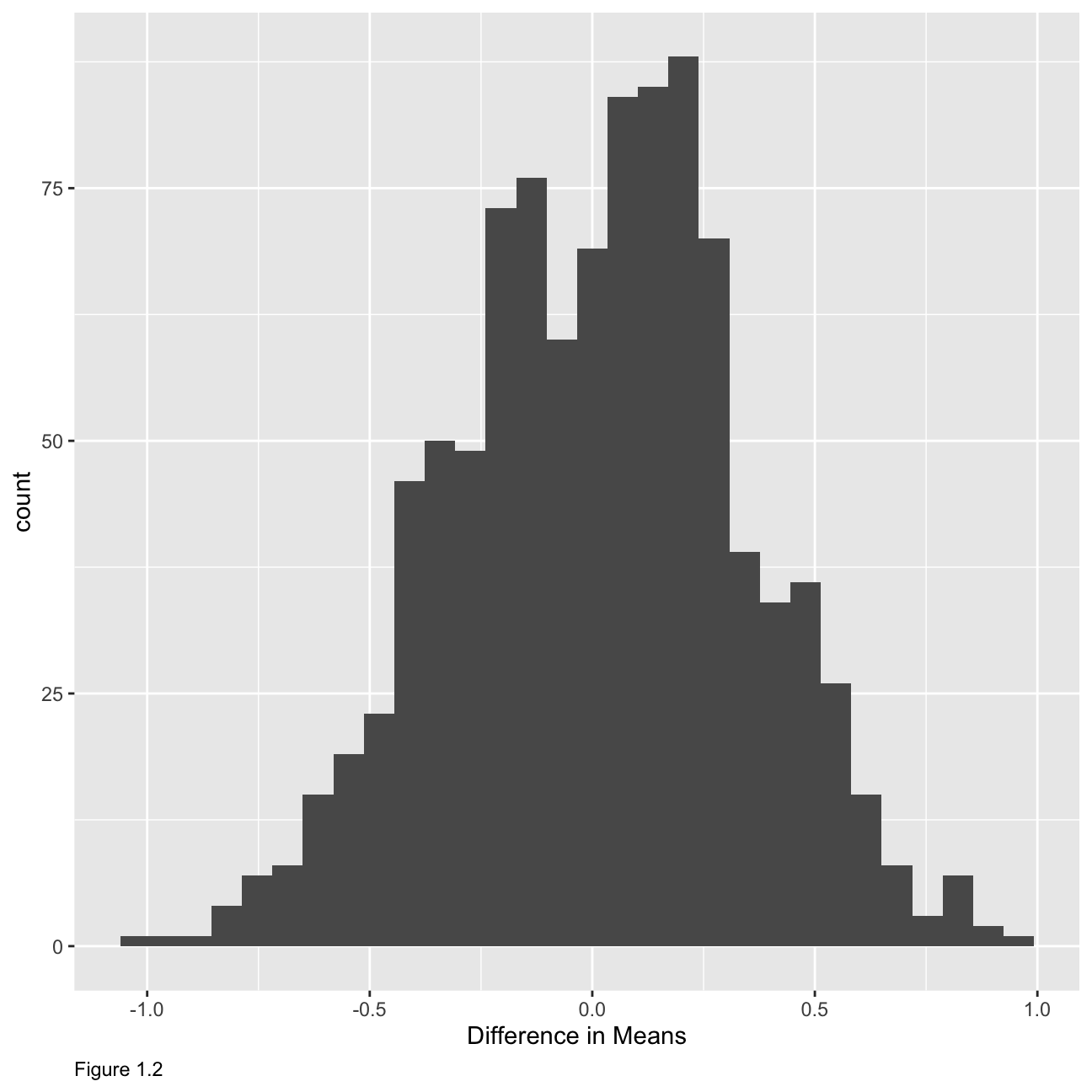
Now that the test is initialized and the null distribution formed, we can visualise to see how many of these null permutations have a difference of at least obs_stat of 1.77?
We can also calculate the p-value for your hypothesis test using the function infer::get_p_value().
null_dist %>%
  visualize() +
  shade_p_value(obs_stat = obs_diff, direction = "two-sided")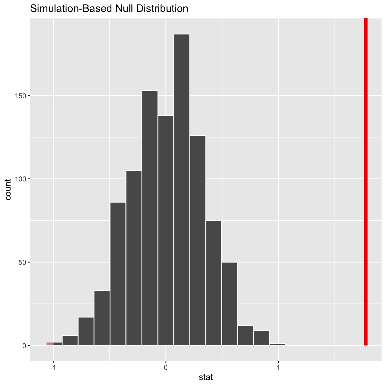
null_dist %>%
  get_p_value(obs_stat = obs_diff, direction = "two_sided")
## # A tibble: 1 × 1
## p_value
## <dbl>
## 1 0This the standard workflow for performing hypothesis tests.
IMDB ratings: Differences between directors
We start by exploring whether the mean IMDB rating for Steven Spielberg and Tim Burton are the same or not. We see the already calculated the confidence intervals for the mean ratings of these two directors that overlap..

First, we reproduce the graph above. In addition, we will run a hypothesis test, using both the t.test command and the infer package to simulate from a null distribution, where we assume zero difference between the two.
Null hypothesis: Spielberg and Burton have the same mean IMDB ratings. Alternative Hypothesis: Speilberg and Burton doesn’t have the same mean IMDB ratings. The sample mean of Spielberg’s mean IMDB ratings is 7.57 and the confidence interval range from 7.27 to 7.87. The sample mean of Burton’s mean IMDB ratings is 6.93 and the confidence interval from 6.53 to 7.33. The t-stat for the hypothesis test is 0.01, which is smaller than 95% confidence interval p-value. The 95% confidence interval range is from 0.16 to 1.13, so 0 is out of the confidence interval. Therefore, there’s enough evidence for us to conclude that we can do that Speilberg and Burton doesn’t have the same population mean IMDB ratings.
You can load the data and examine its structure
movies <- read_csv(here::here("~/Desktop/RR/my_website", "movies.csv"))
glimpse(movies)
## Rows: 2,961
## Columns: 11
## $ title <chr> "Avatar", "Titanic", "Jurassic World", "The Avenge…
## $ genre <chr> "Action", "Drama", "Action", "Action", "Action", "…
## $ director <chr> "James Cameron", "James Cameron", "Colin Trevorrow…
## $ year <dbl> 2009, 1997, 2015, 2012, 2008, 1999, 1977, 2015, 20…
## $ duration <dbl> 178, 194, 124, 173, 152, 136, 125, 141, 164, 93, 1…
## $ gross <dbl> 7.61e+08, 6.59e+08, 6.52e+08, 6.23e+08, 5.33e+08, …
## $ budget <dbl> 2.37e+08, 2.00e+08, 1.50e+08, 2.20e+08, 1.85e+08, …
## $ cast_facebook_likes <dbl> 4834, 45223, 8458, 87697, 57802, 37723, 13485, 920…
## $ votes <dbl> 886204, 793059, 418214, 995415, 1676169, 534658, 9…
## $ reviews <dbl> 3777, 2843, 1934, 2425, 5312, 3917, 1752, 1752, 35…
## $ rating <dbl> 7.9, 7.7, 7.0, 8.1, 9.0, 6.5, 8.7, 7.5, 8.5, 7.2, …grouped_table <- movies %>%
filter(director %in% c("Steven Spielberg", "Tim Burton")) %>%
group_by(director)
clean_table <- grouped_table %>%
summarise(mean = mean(rating), sd = sd(rating), sample_size = n(), se = sd/sqrt(sample_size), t_critical = qt(0.975, sample_size -1), lower = mean - t_critical * se, upper = mean + t_critical * se)
clean_table %>%
ggplot() +
geom_errorbarh(aes(y = director, xmax = upper, xmin = lower, colour = director), width = 0.1, size = 2) +
geom_point(aes(x = mean, y = director, colour = director), size = 5) +
geom_text(x = clean_table$upper, y = clean_table$director, label = round(clean_table$upper,2), vjust = -2, size = 4) +
geom_text(x = clean_table$lower, y = clean_table$director, label = round(clean_table$lower,2), vjust = -2, size = 4) +
geom_text(x = clean_table$mean, y = clean_table$director, label = round(clean_table$mean,2), vjust = -2, size = 5) +
geom_rect(xmin = 7.27, xmax = 7.33, ymin = -Inf, ymax = Inf, alpha = 0.2) +
labs(
title = "Do Speilberg and Burton have the same mean IMDB ratings",
subtitle = "95% percent confidence interval overlap",
x = "mean IMDB ratings"
) +
theme_bw()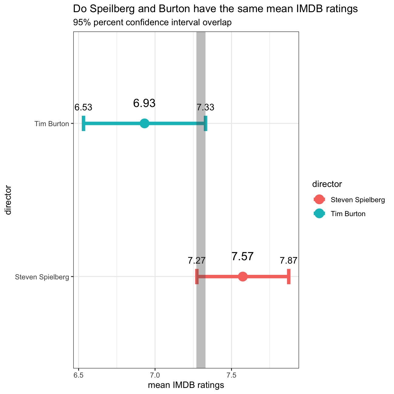
# Hypothesis Test
## t.test()
t.test(rating ~ director ,data = grouped_table)
##
## Welch Two Sample t-test
##
## data: rating by director
## t = 3, df = 31, p-value = 0.01
## alternative hypothesis: true difference in means between group Steven Spielberg and group Tim Burton is not equal to 0
## 95 percent confidence interval:
## 0.16 1.13
## sample estimates:
## mean in group Steven Spielberg mean in group Tim Burton
## 7.57 6.93## infer
set.seed(1234)
infer_table <- grouped_table %>%
specify(rating ~ director) %>%
hypothesise(null = "independence") %>%
generate(reps = 1000, type = "permute") %>%
calculate(stat = "diff in means")
observed_stat <- grouped_table %>%
specify(rating ~ director) %>%
calculate(stat = "diff in means")
infer_table %>%
get_pvalue(obs_stat = observed_stat, direction = "both")## # A tibble: 1 × 1
## p_value
## <dbl>
## 1 0.008Omega Group plc- Pay Discrimination
At the last board meeting of Omega Group Plc., the headquarters of a large multinational company, the issue was raised that women were being discriminated in the company, in the sense that the salaries were not the same for male and female executives. A quick analysis of a sample of 50 employees (of which 24 men and 26 women) revealed that the average salary for men was about 8,700 higher than for women. This seemed like a considerable difference, so it was decided that a further analysis of the company salaries was warranted.
You are asked to carry out the analysis. The objective is to find out whether there is indeed a significant difference between the salaries of men and women, and whether the difference is due to discrimination or whether it is based on another, possibly valid, determining factor.
Loading the data
omega <- read_csv(here::here("~/Desktop/RR/my_website", "omega.csv"))
glimpse(omega) # examine the data frame
## Rows: 50
## Columns: 3
## $ salary <dbl> 81894, 69517, 68589, 74881, 65598, 76840, 78800, 70033, 635…
## $ gender <chr> "male", "male", "male", "male", "male", "male", "male", "ma…
## $ experience <dbl> 16, 25, 15, 33, 16, 19, 32, 34, 1, 44, 7, 14, 33, 19, 24, 3…Relationship Salary - Gender ?
The data frame omega contains the salaries for the sample of 50 executives in the company. Can you conclude that there is a significant difference between the salaries of the male and female executives?
We can perform different types of analyses, and check whether they all lead to the same conclusion
. Confidence intervals . Hypothesis testing . Correlation analysis . Regression
First, we calculate summary statistics on salary by gender. Also, we create and print a dataframe where, for each gender, we show the mean, SD, sample size, the t-critical, the SE, the margin of error, and the low/high endpoints of a 95% confidence interval
# Summary Statistics of salary by gender
mosaic::favstats (salary ~ gender, data=omega)
## gender min Q1 median Q3 max mean sd n missing
## 1 female 47033 60338 64618 70033 78800 64543 7567 26 0
## 2 male 54768 68331 74675 78568 84576 73239 7463 24 0# Dataframe with two rows (male-female) and having as columns gender, mean, SD, sample size,
# the t-critical value, the standard error, the margin of error,
# and the low/high endpoints of a 95% condifence interval
summary_table <- omega %>%
group_by(gender) %>%
summarise(mean = mean(salary), SD = sd(salary), sample_size = n(), t_criticle = qt(0.975, sample_size - 1), SE = SD/sqrt(sample_size), margin_of_error = t_criticle * SE, lower = mean - t_criticle * SE, upper = mean + t_criticle * SE) We observe that the mean salary for men is higher (73239) than for women (64543), the standard deviation is around the same, a bit higher (100 more) for women. Women’s minimum and maximum salaries are also lower. There are 26 observations for women, 24 for men with no missing values in the dataframe.
We can also run a hypothesis testing, assuming as a null hypothesis that the mean difference in salaries is zero, or that, on average, men and women make the same amount of money. You should tun your hypothesis testing using t.test() and with the simulation method from the infer package.
# hypothesis testing using t.test()
t.test(salary ~ gender, data = omega)
##
## Welch Two Sample t-test
##
## data: salary by gender
## t = -4, df = 48, p-value = 2e-04
## alternative hypothesis: true difference in means between group female and group male is not equal to 0
## 95 percent confidence interval:
## -12973 -4420
## sample estimates:
## mean in group female mean in group male
## 64543 73239# hypothesis testing using infer package
set.seed(1234)
infer_table <- omega %>%
specify(salary ~ gender) %>%
hypothesise(null = "independence") %>%
generate(reps = 1000, type = "permute") %>%
calculate(stat = "diff in means")
mean <- omega %>%
filter(gender == "female") %>%
summarise(mean = mean(salary))
observed_stats <- omega %>%
specify(salary ~ gender) %>%
calculate(stat = "diff in means")
infer_table %>%
get_pvalue(obs_stat = observed_stats, direction = "both")## # A tibble: 1 × 1
## p_value
## <dbl>
## 1 0We are confidence to reject the NUll Hypothese and say that the true difference between group males and females is not eaqual to 0. 0 is out of the 95% percent confidence interval and the t-score is bigger than 1.96. Therefore, the gap between mean of salaries between male and female in the sample doesn’t happen by accident.
Relationship Experience - Gender?
At the board meeting, someone raised the issue that there was indeed a substantial difference between male and female salaries, but that this was attributable to other reasons such as differences in experience. A questionnaire send out to the 50 executives in the sample reveals that the average experience of the men is approximately 21 years, whereas the women only have about 7 years experience on average (see table below).
# Summary Statistics of salary by gender
favstats (experience ~ gender, data=omega)
## gender min Q1 median Q3 max mean sd n missing
## 1 female 0 0.25 3.0 14.0 29 7.38 8.51 26 0
## 2 male 1 15.75 19.5 31.2 44 21.12 10.92 24 0We can see that the average experience for women (7.38 years) is indeed lower than for men (21.12), this conclusion does not endanger our conclusion that there is a difference in male and female salaries, it just offers a possible explanation as to why the salaries are different. In a regression model, this would be considered an explanatory variable in our model.At this point we are not able to draw a conclusion whether there is gender-based salary discrimination.
Relationship Salary - Experience ?
Someone at the meeting argues that clearly, a more thorough analysis of the relationship between salary and experience is required before any conclusion can be drawn about whether there is any gender-based salary discrimination in the company.
We analyse the relationship between salary and experience. Draw a scatterplot to visually inspect the data
omega %>%
  ggplot(aes(x = experience, y= salary)) +
  geom_point() +
  theme_bw()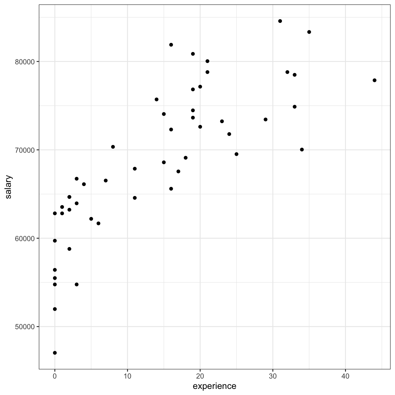
Check correlations between the data
You can use GGally:ggpairs() to create a scatterplot and correlation matrix. Essentially, we change the order our variables will appear in and have the dependent variable (Y), salary, as last in our list. We then pipe the dataframe to ggpairs() with aes arguments to colour by gender and make ths plots somewhat transparent (alpha = 0.3).
omega %>%
  select(gender, experience, salary) %>% #order variables they will appear in ggpairs()
  ggpairs(aes(colour=gender, alpha = 0.3))+
  theme_bw()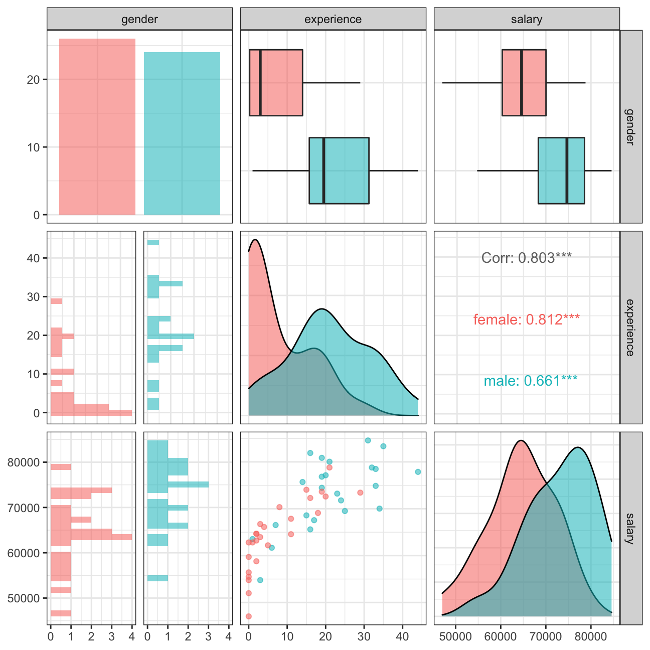
For both male and female, salary increase as experience increase. The experience of female is shorter than males in general. Also, the correlation between salary and experience is 0.8. Experience and salary is more correlated for female than males. Therefore, given the strong correlation and gap between males and female experience, the salary gap might not be caused by gender, but by other factor such as experience.
Challenge 1: Brexit plot
Using your data manipulation and visualisation skills, please use the Brexit results dataframe (the same dataset you used in the pre-programme assignement) and produce the following plot. Use the correct colour for each party; google “UK Political Party Web Colours” and find the appropriate hex code for colours, not the default colours that R gives you.
brexit_results<- read_csv("~/Desktop/RR/my_website/brexit_results.csv")
brexit_results %>%
  ggplot(aes())+
  geom_point(aes(x=con_2015,y=leave_share, color="Conservative"),alpha=0.5,size=0.8)+
  geom_point(aes(x=lab_2015,y=leave_share,color="Labour"),alpha=0.5,size=0.8)+
  geom_point(aes(x=ld_2015, y=leave_share,color="Lib Dems"),alpha=0.5,size=0.8)+
  geom_point(aes(x=ukip_2015, y=leave_share,color="UKIP"),alpha=0.5,size=0.8)+
  geom_smooth(aes(x=con_2015,y=leave_share),method=lm, color="#0087dc")+
  geom_smooth(aes(x=lab_2015,y=leave_share),method=lm,color="#d50000")+
  geom_smooth(aes(x=ld_2015,y=leave_share),method=lm, color="#FDBB30")+
  geom_smooth(aes(x=ukip_2015,y=leave_share),method=lm, color="#EFE600")+

  scale_color_manual(name="",
                     values = c("Conservative"="#0087dc",
                                "Labour"="#d50000",
                                "Lib Dems"="#FDBB30",
                                "UKIP"="#EFE600"))+
  labs(title = "How political affiliation translated to Brexit Voting", y="Leave % in the 2016 Brexit referendum", x="Party % in the UK 2015 general election")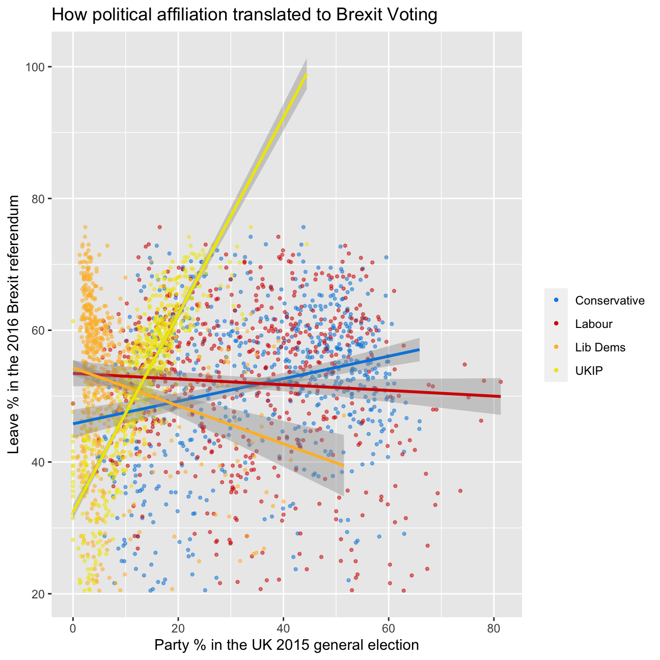
Challenge 2:GDP components over time and among countries
At the risk of oversimplifying things, the main components of gross domestic product, GDP are personal consumption (C), business investment (I), government spending (G) and net exports (exports - imports). You can read more about GDP and the different approaches in calculating at the Wikipedia GDP page.
The GDP data we will look at is from the United Nations’ National Accounts Main Aggregates Database, which contains estimates of total GDP and its components for all countries from 1970 to today. We will look at how GDP and its components have changed over time, and compare different countries and how much each component contributes to that country’s GDP. The file we will work with is GDP and its breakdown at constant 2010 prices in US Dollars and it has already been saved in the Data directory. Have a look at the Excel file to see how it is structured and organised
UN_GDP_data  <-  read_excel(here::here("~/Desktop/RR/my_website", "Download-GDPconstant-USD-countries.xls"), # Excel filename
                skip=2) # Number of rows to skip
The first thing you need to do is to tidy the data, as it is in wide format and you must make it into long, tidy format. Please express all figures in billions (divide values by 1e9, or \(10^9\)), and you want to rename the indicators into something shorter.
tidy_GDP_data  <-  UN_GDP_data %>%
  pivot_longer( cols = 4:51,
                names_to = 'year',
                values_to = 'value') %>%
  mutate(value = value/1e9,
         IndicatorName = replace(IndicatorName, IndicatorName == 'Exports of goods and services', 'Exports'),
         IndicatorName = replace(IndicatorName, IndicatorName == 'General government final consumption expenditure', 'Government expenditure'),
         IndicatorName = replace(IndicatorName, IndicatorName == "Household consumption expenditure (including Non-profit institutions serving households)", 'Household expenditure'),
         IndicatorName = replace(IndicatorName, IndicatorName == 'Imports of goods and services', 'Imports'))

glimpse(tidy_GDP_data)
## Rows: 176,880
## Columns: 5
## $ CountryID <dbl> 4, 4, 4, 4, 4, 4, 4, 4, 4, 4, 4, 4, 4, 4, 4, 4, 4, 4, 4,…
## $ Country <chr> "Afghanistan", "Afghanistan", "Afghanistan", "Afghanista…
## $ IndicatorName <chr> "Final consumption expenditure", "Final consumption expe…
## $ year <chr> "1970", "1971", "1972", "1973", "1974", "1975", "1976", …
## $ value <dbl> 5.56, 5.33, 5.20, 5.75, 6.15, 6.32, 6.37, 6.90, 7.09, 6.…# Let us compare GDP components for these 3 countries
country_list <- c("United States","India", "Germany")First, can you produce this plot?
# clean data
clean_table <- tidy_GDP_data %>% filter(Country %in% c("United States","India", "Germany"), IndicatorName %in% c("Gross capital formation", "Exports", "Government expenditure", "Household expenditure","Imports", ""), year                                  >=1970) %>% mutate(year = as.numeric(year))

# plot
clean_table %>% ggplot(aes(x = year, y = value, colour = IndicatorName, group = IndicatorName)) +
  geom_smooth(aes(x = year, y = value), se = FALSE, span = 0.2) +
  facet_wrap(~ Country) +
  labs(
    title = "GDP Components over time",
    subtitle = "In constant 2010 USD",
    x = NULL,
    y = "Billion US$"
  ) +
  theme_bw() +
  NULL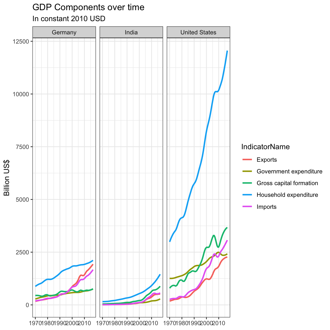
Secondly, recall that GDP is the sum of Household Expenditure (Consumption C), Gross Capital Formation (business investment I), Government Expenditure (G) and Net Exports (exports - imports). Even though there is an indicator Gross Domestic Product (GDP) in your dataframe, I would like you to calculate it given its components discussed above.
What is the % difference between what you calculated as GDP and the GDP figure included in the dataframe?
As calculated below, For Germay, the % difference range from 1.0% to 1.04%. THe India range from 1.08% to 0.0%. United States range from 1.0% to 1.04%.
# calculate GDP
export <- clean_table %>%
  filter(IndicatorName == "Exports") %>%
  rename("Exports" = "IndicatorName")
import <- clean_table %>%
  filter(IndicatorName == "Imports") %>%
  rename("Imports" = "IndicatorName")
household_expenditure <- clean_table %>%
  filter(IndicatorName == "Household expenditure") %>%
  rename("Household expenditure" = "value")
Government_expenditure <- clean_table %>%
  filter(IndicatorName == "Government expenditure") %>%
  rename("Government expenditure" = "value")
Gross_capital_formation <- clean_table %>%
  filter(IndicatorName == "Gross capital formation") %>%
  rename("Gross capital formation" = "value")
net_exports <- left_join(export, import, by = c("year", "Country")) %>%
  mutate(net_exports = value.x - value.y) %>%
  select(year, Country, net_exports)

merge1 <- left_join(household_expenditure, Government_expenditure, by = c("Country", "year"))
merge2 <- left_join(merge1, Gross_capital_formation, by = c("Country", "year"))
merge3 <- left_join(merge2, net_exports, by = c("Country", "year"))

GDP_table <- merge3 %>%
  mutate(GDP = `Household expenditure`+ `Government expenditure`+ `Gross capital formation`+ net_exports) %>%
  select(year, Country, `Household expenditure`, `Government expenditure`, `Gross capital formation`, net_exports, GDP) %>%
  pivot_longer(cols = 3:6, values_to = "values", names_to = "Indicator")

origion_GDP <- tidy_GDP_data %>%
  filter(IndicatorName == "Gross Domestic Product (GDP)") %>%
  mutate(year = as.numeric(year)) %>% group_by(year, Country) %>%
  summarise(Country = Country, year = year, origin = mean(value))

GDP <- GDP_table %>%
  select(GDP, year, Country)

compare_GDP <- left_join(GDP, origion_GDP, by = c("Country" = "Country", "year" = "year")) %>%
  group_by(year, Country) %>%
  summarise(percent_diff = GDP/origin)

proportion_table <- GDP_table %>%
  mutate(proportion = values/GDP)

# plot GDP change
compare_GDP %>%
  ggplot(aes(x = year, y = percent_diff)) +
  geom_line(aes(x = year, y = percent_diff)) +
  facet_wrap(~Country) +
  labs(
    title = " % difference between what you calculated as GDP and the GDP figure included in the dataframe"
  ) +
  theme_bw()+
  NULL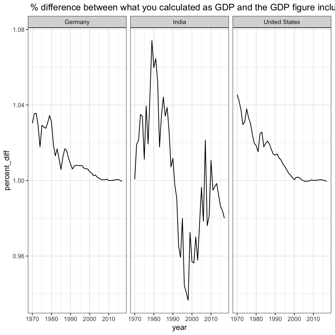
# plot proportion
proportion_table %>%
  ggplot(aes(x = year, y = proportion, colour = Indicator, group = Indicator)) +
  geom_smooth(aes(x = year, y = proportion), se = FALSE, span = 0.1) +
  facet_wrap(~ Country) +
  labs(
    title = "GDP and Its breakdown at constant 2010 prices in US Dollars",
    x = NULL,
    y = "proportion"
  ) +
  theme_bw() +
NULL 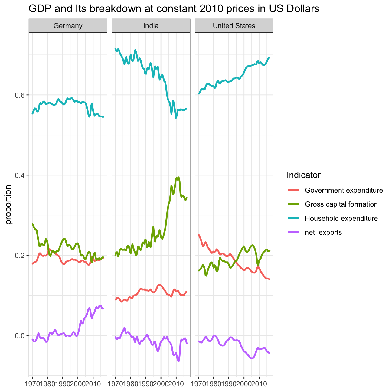
What is this last chart telling you? Can you explain in a couple of paragraphs the different dynamic among these three countries?
Looking at Germany’s GDP breakdown, it’s interesting to note that household expenditures kept a quite steady proportion throughout the whole period, except around the 2008 financial crisis, of which the impact is quite noticeable for all three countries, with Germany’s gross capital formation also having a clear dip around that time. Germany being the only out of the three countries that is part of the European union, it is also interesting to note their exports increasing after the Maastricht, Amsterdam and Lisbon treaties were put into place. On a different note, we would also expect the reunification of the west and east Germanies to have a clear impact on the proportion of government expenditure, yet there does not seem to be.
India’s GDP breakdown is quite different from Germany’s. The 2008 financial crisis is quite noticeable as well and seems to particularly have impacted exports, as other countries lost disposable income. It is interesting to note that the government expenditure is around 15% of the GDP throughout the whole period, yet that gross capital formation gains a bigger proportion whilst the proportion of household expenditure keeps on decreasing. We can infer that this is due to a growing population, with increased inequalities; bigger companies and more billionaires, but also more poverty, resulting in less household expenditure.
The United States’ GDP split also showcases the impact of the 2008’s financial crisis, for instance with the Federal Reserve’s help towards the bank creating a small red bump in the late 2000s, early 2010s. Overall, government expenditure’s proportion kept on decreasing as republicans were in office, reducing government spending. It is interesting to note that other major financial crisis did not really impact the way the GDP is split up (2001, 1987).